Typical early examples in Complex analysis involve plotting simple complex (as in \(\mathbb{C}\)) curves under (complex) transformations. This help gain intuition on otherwise rather opaque transformations; see for instance those two videos from Michael Penn’s Youtube channel:
Plotting such curves, regardless of the software (Mathematica, Gnuplot, etc.) is performed in three steps:
- parametrize the curves;
- compute the transformation by applying it to the parametrization;
- isolate the real and imaginary parts of the last result.
As a reminder, curves are said to be described implicitly when their description only allow to check whether a given point is or isn’t on the curves (e.g. \(x^2+y^2=r^2\)). They are said to be described explicitly when their description can generate all the points of the curve from some well-defined input (e.g. \(\pmb{r}(t)=\left\lt r\cos t|r\sin t\right\gt \), \(t\in[0,2\pi]\), vector-valued then). A parametrization is an explicit curve description.
Example: Given a curve defined by \(y=\phi(x)\), we can always parametrize it with:
\[ z(x) = x + iy = x + i\phi(x) \] \[ \Rightarrow \boxed{z(t) = t+i\phi(t)} \]
This comes from identifying the projection on the x-axis of the curve with the real part of \(z(t)\) and the projection on the y-axis with the imaginary part of \(z(t)\).
Note: \(t\) is a common name variable for curve parametrization. \(u, v\) are commonly used for surface parametrization.
Note: This is an immediate variant of the vector-valued parametrization for 2D curves:
\[ \pmb{r}(t) = \left\lt x(t),y(t)\right\gt = \boxed{\left\lt t,\phi(t)\right\gt} \]
A North Easter off the Cornish coast, 1894, oil, on canvas (?)
by
David James (1853–1904)
Explicit treatment
The following can be more or less tedious, depending on the functions involved, and you’d generally want to leverage the abilities of your software. Yet, it’s still useful to know how to handle the maths, for the sake of it and to compensate for potential software issues (either usage mistakes, or simply “missing” features).
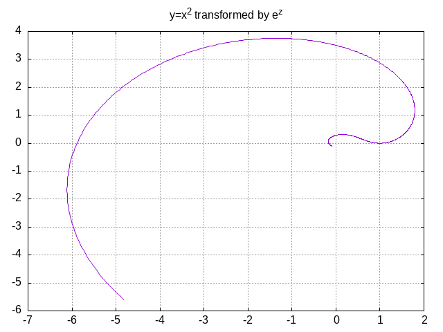
Consider the following example, as given from the second video, to plot the transformation of \(y=x^2\) under the complex exponential \(z\mapsto e^z\).
- By the previous paragraph, the curve has the following complex parametrization:
\[ \boxed{z(t) = t+it^2} \]
- We now need to compute the image by the exponential, and isolate the imaginary part from the real part:
\[\begin{aligned} e^{z(t)} &&=\quad& e^{t+it^2} \\ ~ &&=\quad& e^te^{it^2} \\ ~ &&=\quad& \boxed{e^t(\cos t^2+i\sin t^2)} \end{aligned}\]
- From there we draw:
\[\begin{aligned} \Re(e^{z(t)}) &&=\quad& e^t\cos t^2 \\ \Im(e^{z(t)}) &&=\quad& e^t\sin t^2 \\ \end{aligned}\]
Let’s for instance use Gnuplot to visualize the result:
# Boilerplate to generate an image; this is uneeded
# if you run gnuplot(1) from its toplevel for instance.
set terminal png;

# With a png terminal, output is sent to STDOUT. This gives
# the caller control over filename/output directory.
set output;

# Display a little grid, for clarity
set grid;

# Set and title and remove the default plot legend
set title "y=x^2 transformed by e^z";
set nokey;

# Increase sampling (smoothness)
set samples 1000;

# Tell gnuplot(1) we want to use parametric plot
# Implicitly/by default, the plot variable name for curves
# will be t, a common convention.
set parametric;

# So we can set the range for this t variable:
set trange [-2:2];

# And finally (parametrically) plot the resulting
# curve, with the real part on the x-axis and the
# imaginary part of the y-axis
plot exp(t)*cos(t**2), exp(t)*sin(t**2);
Exercise: Plot \(y=x^3\) under the (complex) transformation \(z\mapsto z^2\).
Simplified/generic treatment
Let’s slightly revisit our previous example, leveraging Gnuplot so as to help make things a little more systematic, and to reduce manual computations. The end result is now very close to what Michael Penn gets with Mathematica:
# Boilerplate to generate an image; this is uneeded
# if you run gnuplot(1) from its toplevel for instance.
set terminal png;

# With a png terminal, output is sent to STDOUT. This gives
# the caller control over filename/output directory.
set output;

# Display a little grid, for clarity
set grid;

# Set and title and remove the default plot legend
set title "y=x^2 transformed by e^z";
set nokey;

# Increase sampling (smoothness)
set samples 1000;

# Tell gnuplot(1) we want to use parametric plot
# Implicitly/by default, the plot variable name for curves
# will be t, a common convention.
set parametric;

# So we can set the range for this t variable:
set trange [-2:2];

# Transformation function
g(z) = exp(z);

# Parametrized curve to be transformed
f(t) = t+(t**2)*{0,1};

# And finally (parametrically) plot the resulting
# curve, with the real part on the x-axis and the
# imaginary part of the y-axis
plot real(g(f(t))), imag(g(f(t)));

Note: While this form can hide maths under the hood, and
hinder comprehension, it also allows for systematic processing. For instance,
it’s almost trivial now to generate one image per function/trange couple,
given a basic sh(1) script. Or Python if that’s your thing;
I’m not sure Gnuplot itself is very suited for that.
Exercise: Have a look at the videos above: there’s a bunch of plot ideas for you to experiment with. Try to use sh(1) (or any other scripting language at your disposal) to generate one or multiple Gnuplot scripts to plot complex transformation of parametrized functions on a specific range, described in a file such as:
# title                         function                    trange
"y=2x-5 transformed by e^z"		f(t)=t+(2*t-5)*{1,0}		[-7:7]
"x^2-y^2=1 transformed by e^z"	g(t)=cosh(t)+sinh(t)*{1,0}	[-3:3]
"y=|x| transformed by e^z"		h(t)=t+abs(t)*{1,0}         [-3:1.7]
...
Try to plot all those functions under multiple different transformations (e.g. \(z\mapsto e^z\) and \(z\mapsto z^2\)). You may want to use a different range for each transformation.
PGF/Tikz and PGFPlots examples
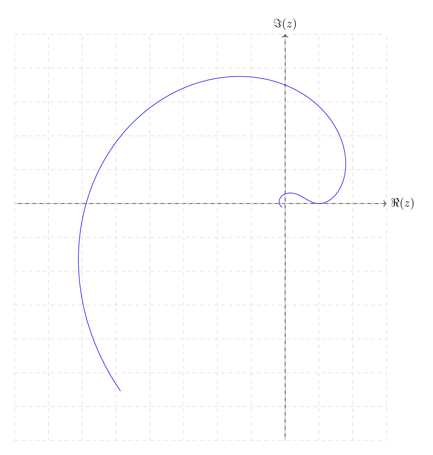
Typically, PGF/TikZ, a common package to handle plots from within \(\LaTeX\), can’t perform complex (\(\mathbb{C}\)) arithmetic directly, at least, as far as I know; maybe there’s a package somewhere. So we “have” to use a more manual approach.
\documentclass[tikz]{standalone}
\usepackage{tikz}
% Most of those are useless here, but I've grown
% tired of filtering.
\usetikzlibrary{
	snakes,calc,patterns,angles,quotes,
	decorations.pathmorphing,math,
	decorations.pathreplacing,automata,
	arrows.meta,positioning,external
}

\begin{document}
	\begin{tikzpicture}
		% This is from a tikzlibrary (math), which
		% allows us to define a few variables so as
		% to parametrize the rest of the code
		\tikzmath{
			\xmin = -7;
			\xmax = 2;
			\ymin = -6;
			\ymax = 4;
			\tmin = -2;
			\tmax = 2;
		}

		% (manually) drawing the x-axis
		\draw[->] (\xmin-1, 0) -- (\xmax+1, 0)
			node[right] {$\Re(z)$};

		% (manually) drawing the y-axis
		\draw[->] (0, \ymin-1) -- (0, \ymax+1)
			node[above] {$\Im(z)$};

		% (manually) drawing a grid
		\draw[color=gray!30, dashed] (\xmin-1,\ymin-1)
			grid (\xmax+1,\ymax+1);

		% and finally, our parametric plot, smoothed with
		% both smooth & samples=1000; the parameter is
		% t, its range is given by domain
		%
		% there's a subtletie regarding trigonometric function,
		% which needs to be provided an r (e.g. cos(\t r)) to
		% indicate radians. Otherwise, t is interpreted as
		% degrees.
		\draw[
			domain=\tmin:\tmax, smooth,
			samples=1000, variable=\t, blue
		] plot ({exp(\t)*cos(\t*\t r)},{exp(\t)*sin(\t*\t r)});
	\end{tikzpicture}
\end{document}
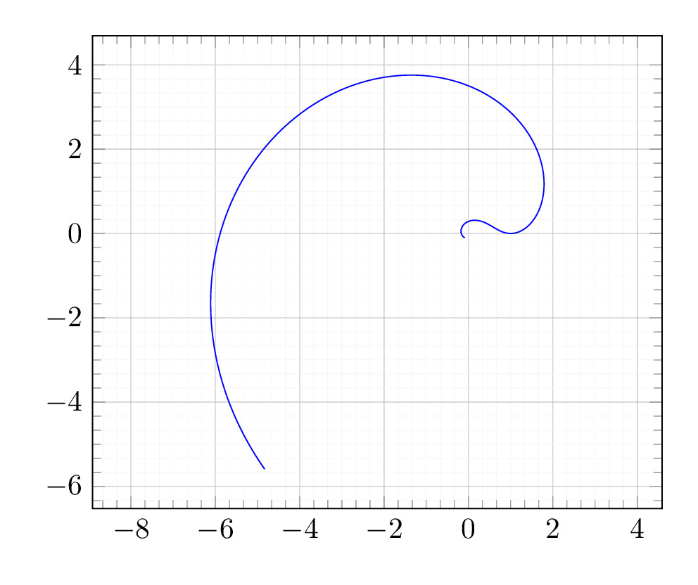
PGFPlots, another \(\LaTeX\) plotting package, which doesn’t (directly) handle complex numbers either, thus again the need to be able to do the maths:
\documentclass[pgfplots]{standalone}
\usepackage{pgfplots}
\begin{document}
	\begin{tikzpicture}
		\begin{axis}[
			trig format plots=rad,
			axis equal,
			grid=both,
			grid style={line width=.1pt, draw=gray!10},
			major grid style={line width=.2pt,draw=gray!50},
			minor tick num=5,
		]
			\addplot [domain=-2:2, samples=500, blue]
				({exp(x)*cos(x*x)},{exp(x)*sin(x*x)});
		\end{axis}
	\end{tikzpicture}
\end{document}
Exercise: How would you repeat the previous exercise, using either TikZ or PGFPlots (and without using Gnuplot: IIRC, Gnuplot can be called from at least TikZ).
High Noon, The Walmer Castle, oil on canvas,
by
Montague Dawson (1890–1973)
Comments
By email, at mathieu.bivert chez: