Historically, human figure depiction has always been a fundamental aspect of Western fine-art. The gracefulness of the poses, the subtle variations of volumes, induced by a complex underlying anatomy, often geometrically simplified, the diversity of complexions, our high-sensibility to its visual correctness, its semantical role in artworks, all contribute to making it a key part of a painter’s education.
As for watercolors or drawing courses, a contemporary issue isn’t the scarcity of instruction, as it once was, but rather its abundance, potentially confusing for (self-taught) students.
As such, the goal of this series, rather than to contribute to the noise, is to provide a map, to help navigate the existing material.
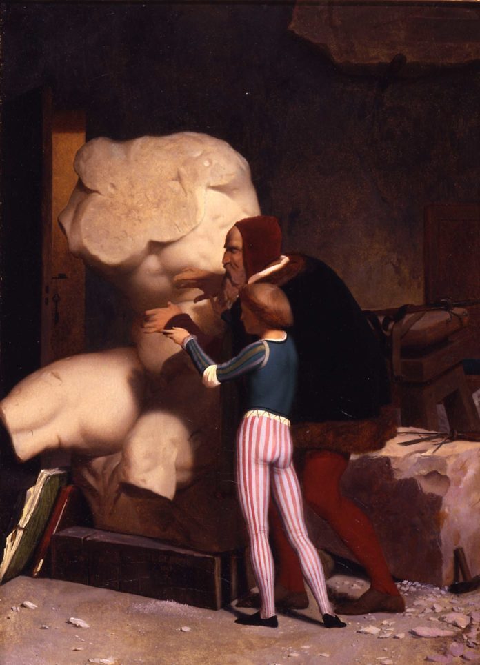
Michelangelo being shown the Belvedere Torso, oil on canvas, 1849, Dahesh Museum of Art, New York
by
Jean-Léon Gérôme
Loose and meticulous
We must first acknowledge that there isn’t a single approach to figure drawing/painting (we’ll use the two words interchangeably); we can grossly grade existing approaches on a scale, ranging from loose to meticulous.
The looser approach tends to be favored for animation and quick sketches, while the meticulous one best corresponds to fine-art, but as we’ll see, this is just a tendency.
Note: Such a dichotomy had already been established in water-based traditional Chinese painting; see Gongbi (工筆) and Shuimo (水墨).
Actually, those two extreme approaches are better understood as complementaries rather than as opposites: drawing quick figures is excellent for developing appealing compositions, to representing distant people in a crowd in a polished piece, or to start a refined drawing. Longer drawings are excellent to develop visual sensibility, understanding of anatomy, visual memory, or simply one’s ability to spend an extended periods of time on focused work.
Examples
To make things clear, we provide here a few drawings, approximately ranging from loosest to most refined, exemplifying this scale.
Carrot people
This must be the simplest way of aesthetically depicting the human figure. Variety can be added by adjusting height and width, ratios of the parts (head vs. torso vs. legs), perspective, colors, for instance to delineate clothes, etc. The approach is notably used in modern loose watercolor street scenes.
Note: This approach, despite its frugality, carries a noticeable appeal, hence its success: the body simplified as such actually corresponds to the silhouette of a figure in motion.
Below is a typical example of an improvement on carrot persons:
- legs are delineated;
- variety in color to suggests cloths;
- perspective (heads kept on the same level, while the floor and head sizes recede)
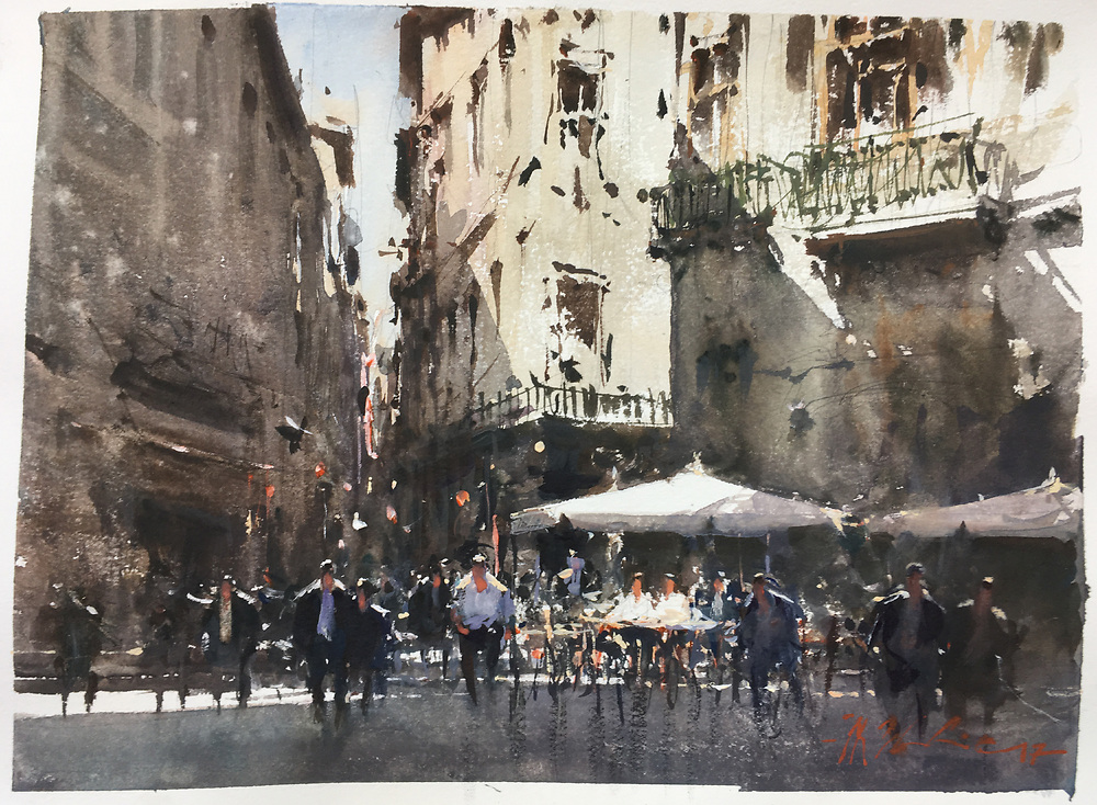
Sunny corner, Barcelona, Spain
by
Joseph Zbukvic
Silhouettes
Silhouettes can be thought of as a generalization of “carrot people”, in that they can represent more than moving people. They are heavily used in character design (animation, illustration), to help make sure that the figure and its action reads easily.
While appreciable on their own, silhouettes can also be thought of as one step in character design process, as demonstrated above by Marco Bucci.
In traditional Chinese paintings, and more generally, in Eastern paintings, people are often depicted with simplicity, with a strong emphases on the silhouette, such as in those representations of the first two emperors of the Tang dynasty:
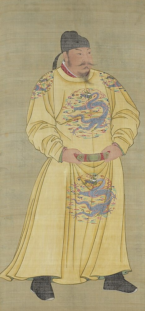
Emperor Gaozu of Tang, 598 - 649, second emperor of the Tang dynasty through wikimedia.org – Public domain
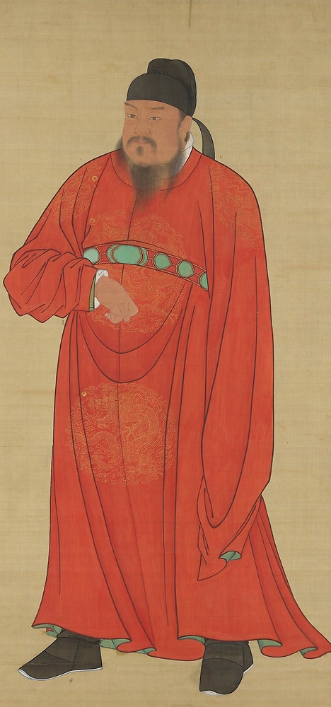
Emperor Gaozu of Tang, 566 - 635, founder and first Emperor of the Tang dynasty through wikimedia.org – Public domain
Gesture sketches, action drawings
Gesture is a confusing word, often defined at best nebulously (e.g. “flow of the form”). The situation is confusing enough that the following article of this series will be dedicated to exploring this specific topic. That being said, generally, when people talk about “gesture”, they talk about drawings having a feel similar to this one:
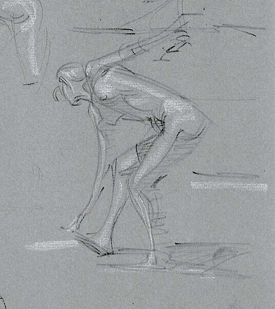
An example of gesture, from the book Figure Drawing for artists, p.39
by
Steve Huston
While some modern artists may satisfy themselves with such drawings, which do carry some aesthetic qualities, as we’ll explain later they are, as silhouettes, most often used as intermediate steps towards more refined drawings. Nevertheless, when performed by expert craftsmen, their simplicity, their liveliness is impossible to replicate with refined drawings.
In animation, such drawings are more simplified, emphasize the character’s action, often comically, so as to help the viewers better understand the situation. They aren’t or weren’t called “gesture drawings” but do serve similar purposes. Back in the days, before computers, animation was performed manually; professionals had thus to develop efficient and expressive approaches to figure drawings, and thus are definitely worth studying.
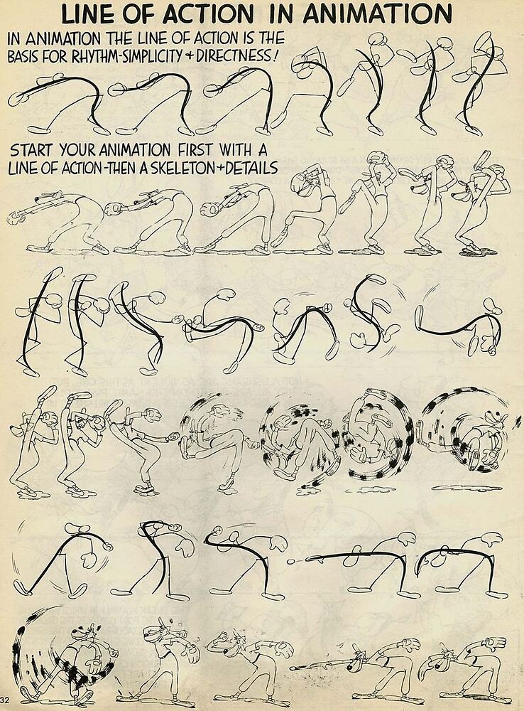
Line of action in animation, a “variant” of gesture; from Advanced animation (1947)
by
Preston Blair
Sketches
Note: the choice of sketches as a denomination here is arbitrary, as people use the word broadly; the meaning should be clear enough from context.
As for gesture drawings, sketches, while sometimes appreciated on their own, again are building blocks for more refined projects, or serve a specific purpose, such as capturing a situation on the spot, teaching something, etc. They can be performed on top of a gesture drawing, where the gesture drawing is used as a quick way to place the figure and establish major proportions.
George B. Bridgman (1864-1943)’s drawings, originally created for teaching in classes, and now compiled in multiple books such as Bridgman’s Complete Guide To Drawing From Life (CC BY NC ND 4.0), where often crude, to the point, and aimed at helping students to gain a practical understanding of human anatomy.
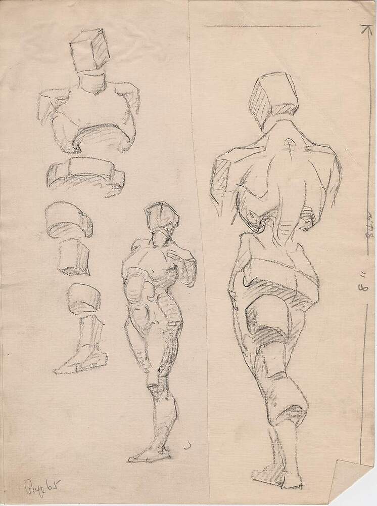
Distribution of masses, pencil on paper, 1924, ©George B. Bridgman/Sterling Publishing Company, Inc.
by
George B. Bridgman (1864-1943)
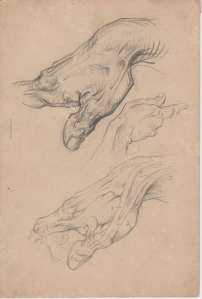
Hand, thumb, details, pencil on paper, 1920, ©George B. Bridgman/Sterling Publishing Company, Inc. (1- long extensor of the thumb; 2- short extensor of the thumb; 3- long abductor of the thumb
by
George B. Bridgman (1864-1943)
Quick sketches exist in a variety of style, depending on how and why they are executed. Below is an early sketch of Luca Cambiaso (1527 – 1585) with ink on paper, performed as a composition sketch, likely in preparation of a more finished piece:
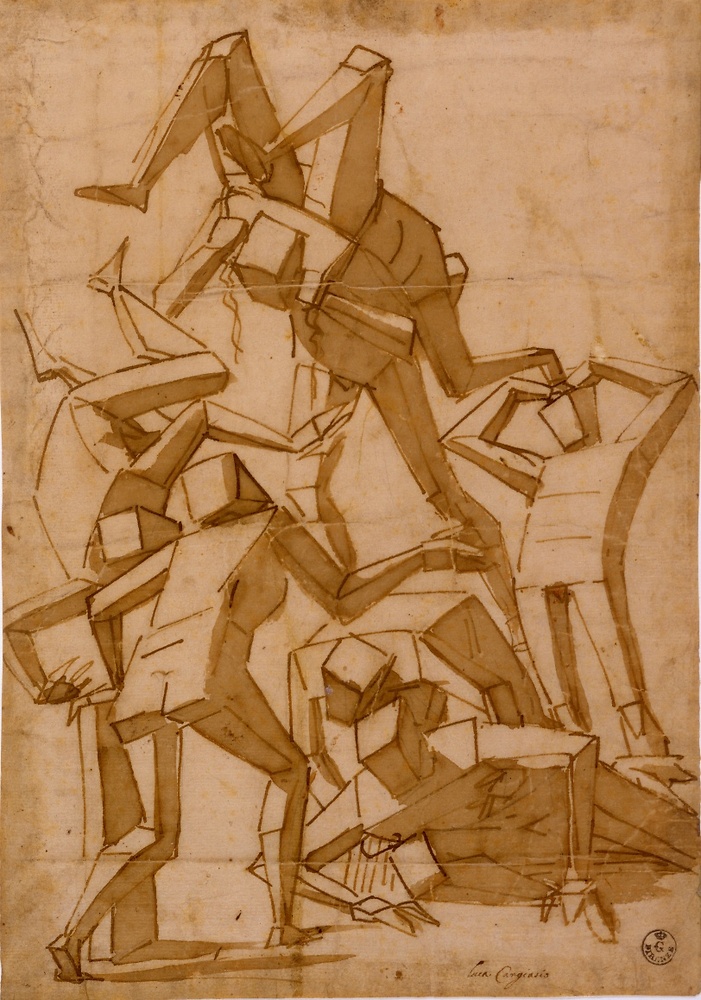
Ink on toned paper, likely in preparation of a painting, mid 1500s
by
Luca Cambiaso (1527 – 1585)
In a similar vein, here’s a page by Leonardo (1452-1519), said to be in preparation of the Battle of Anghiari, studying horses and comparing the same facial expression on a man, a big cat, with some mentions of horse’s facial anatomy:
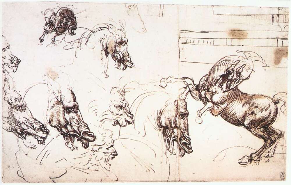
Study of horses for the Battle of Anghiari, mostly pen and ink on paper, c. 1503
by
Leonardo da Vinci
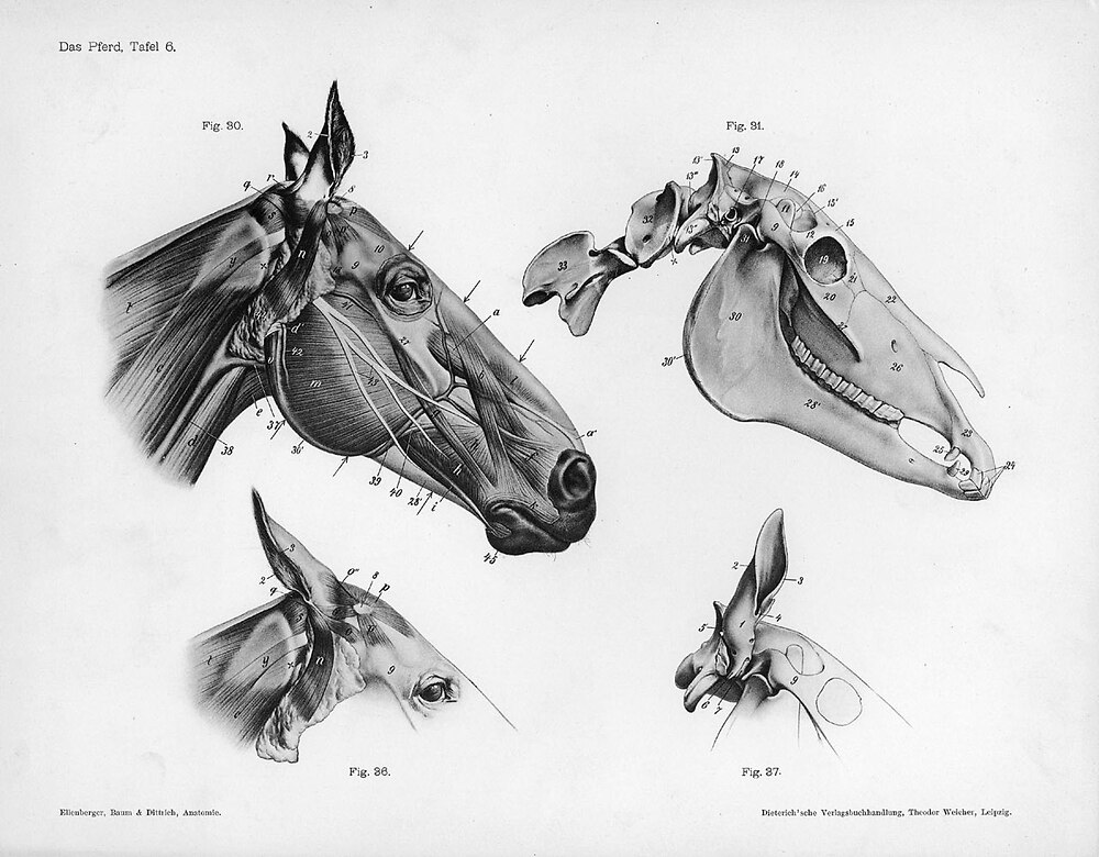
Animal anatomical engraving, horse’s head, from the Handbuch der Anatomie der Tiere für Künstler, c. 1889 by Wilhelm Ellenberger and Hermann Baum through wikimedia.org – Public domain
Academies
Academies are in-depth studies of the human figure, from a living model. It is a typical exercise performed in fine art academies and ateliers:
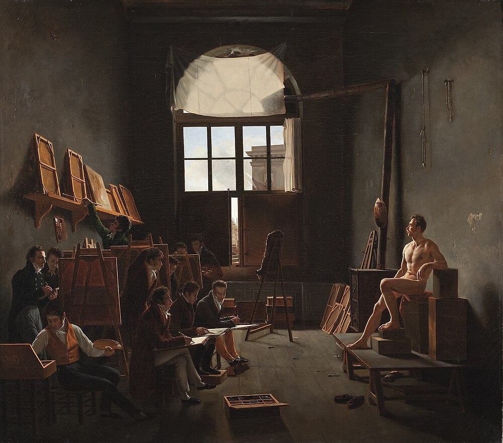
The Studio of Jacques-Louis David, oil on canvas, 1814, 91.1 cm (35.8 in) by 102.8 cm (40.5 in), Louvre, Paris, France
by
Léon Matthieu Cochereau (1793–1817)
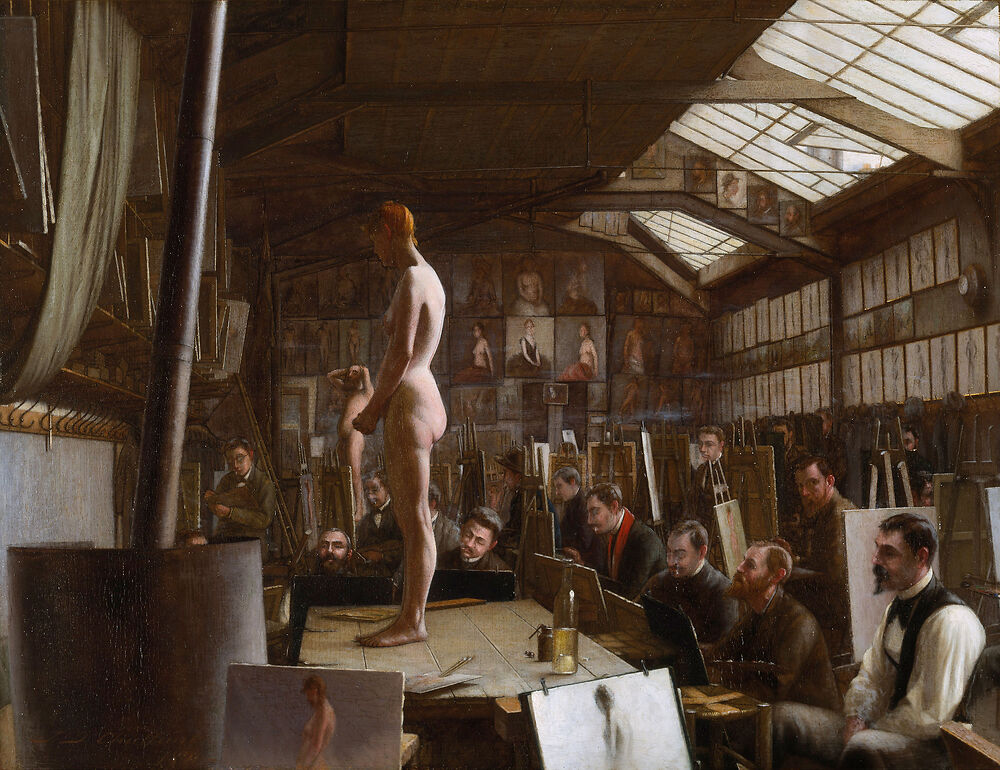
Bouguereau’s Atelier at the Académie Julian, Paris, oil on panel, 1891, 11.2 in (28.5 cm); width: 14.5 in (36.8 cm)
by
Jefferson David Chalfant (1856-1931)
Note: Mind the lighting (north-facing windows, a stable source of natural “white” light), the inspiring artworks, drying paintings, the need to keep the (naked) models warm, the difference in finesse between the two artworks, regarding the figure’s rendition for instance (you may want to zoom).
Despite the second being a female, most often, academies were depicting males: not only (male) students would be less likely to get distracted, but anatomical details are more blatant on a male figure.
During the Renaissance, drawings were essentially intermediate steps in preparation for paintings, or exercises. The two followings are by Raphael (1483-1520).
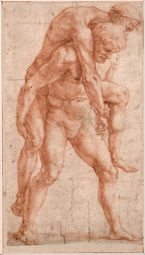
Young man carying an old man on his back, sanguine on paper, 1514
by
Raphael (Raffaello Sanzio)
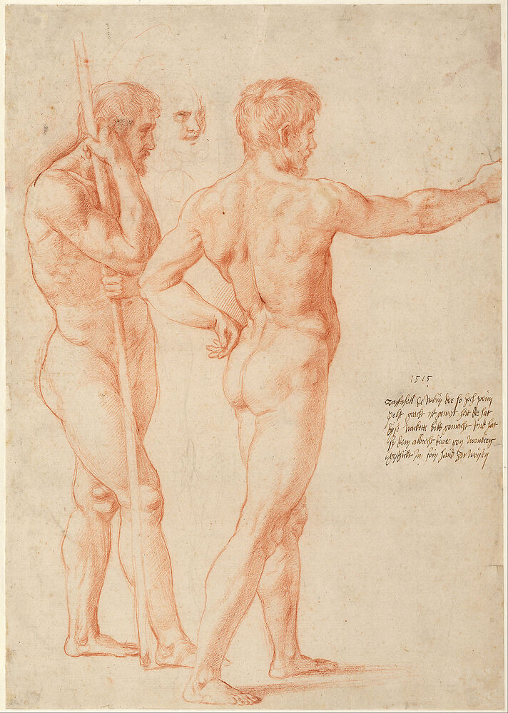
Nude studies, sanguine on paper, 1515
by
Raphael (Raffaello Sanzio)
The practice spreads throughout Europe over the centuries, showcasing a masterful appreciation of anatomy:
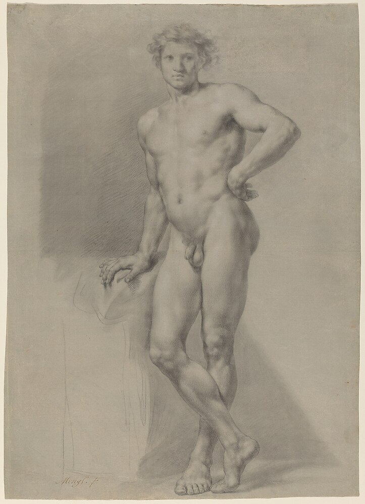
Standing male, front, Pierre Noire and white chalk, 53x37cm. Germany, 1700s
by
Anton Raphael Mengs
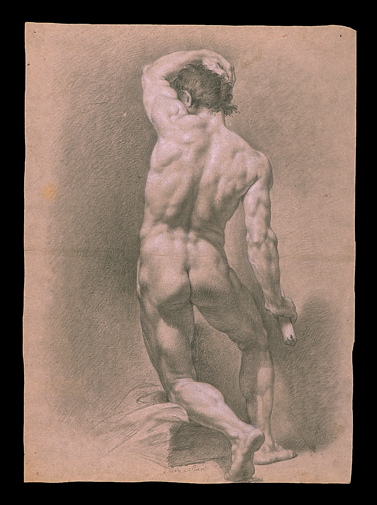
Male nude, back, one leg sitting on a step, pencil and white chalk, 54x39cm. Spain, 1864
by
Juan Adán Morlán (1741-1816)
Perhaps contrary to what one would have expected, brutal socialists dictators did also fought against what some of them called degenerate art. Ultimately, in line with what we would expect, their intents still were far from pure benevolence.
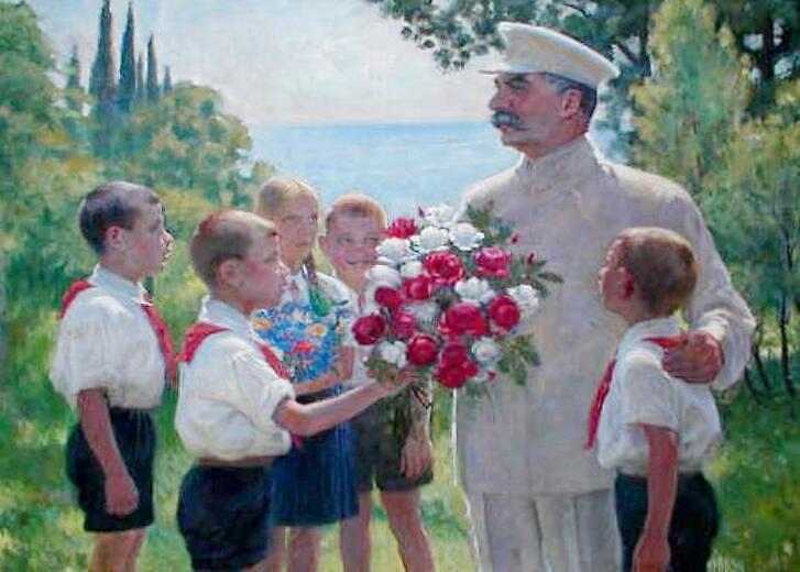
Roses for Stalin, 1949, picture by Roger Williams by Boris Ieremeevich Vladimirski through wikimedia.org – CC-BY-SA-2.0
As a result, in Russia, contrary to what happened in the rest of Europe, the teaching lineage hasn’t been disturbed by modern art, and the methods are basically the same as they were a few centuries ago. The followings are low-resolution excerpts (the printed book is much better) from a compilation of old drawings collected by Vladimir Mogilevtsev (В. А. Могилевцев), current head of the drawing Department at the Russian Academy of Arts.
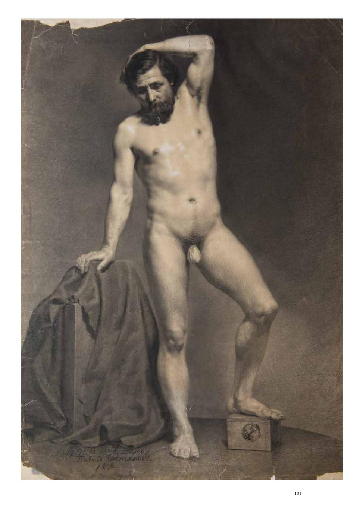
Standing male model, 1854, 80×60, paper, italian pencil, charcoal, chalk, from Drawing Samples for Copying / Obraztsy Dlya Kopirovaniya, page 100 by tchistiakov – Public domain
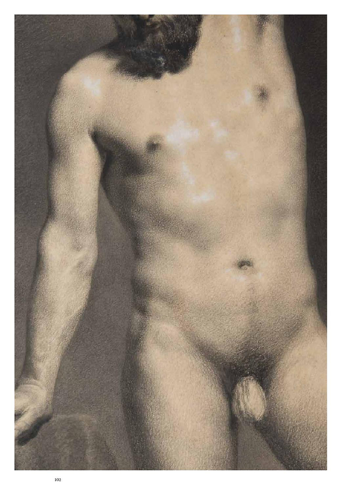
Standing male model, 1854, 80×60, paper, italian pencil, charcoal, chalk, from Drawing Samples for Copying / Obraztsy Dlya Kopirovaniya, page 101 by Pavel Tchistiakov – Public domain
Not all drawings from the book have that kind of polish: below, the first one is kept rather simple, while the second relies on a sophisticated cross-hatching (again, you may want to zoom-in as this is not obvious from the thumbnails):
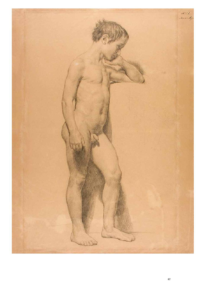
Nude boy model, c. 1840, 57×43, paper, italian pencil, charcoal pencil, chalk, from Drawing Samples for Copying / Obraztsy Dlya Kopirovaniya, page 86 by Alexander Ivanov – Public domain
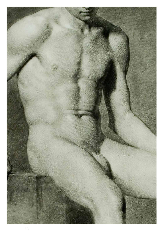
(Young) Male model, c. 1846, 65×50, paper, italian pencil, from Drawing Samples for Copying / Obraztsy Dlya Kopirovaniya, page 92 by Ivan Makarov – Public domain
Note: Notice how benign the depiction of naked boys was about a century ago. This isn’t a peculiarity of Russian academists: it was normal for young boys to play naked on the beaches in Spain for instance:
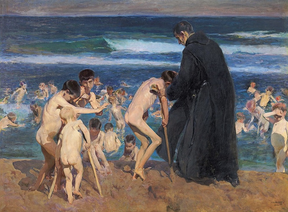
Sad inheritance, oil on canvas, 1899, 210×285cm (82.6×112.2in)
by
Joaquín Sorolla
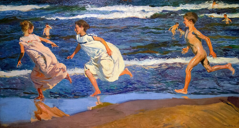
Corriendo por la playa, oil, 1908
by
Joaquín Sorolla
Paintings, finished pieces
We’ve already started to transition to colors and finished works with the two previous Sorolla paintings, but let’s go back to academies for a moment: being a teaching exercise, they were naturally pushed beyond monochromes:
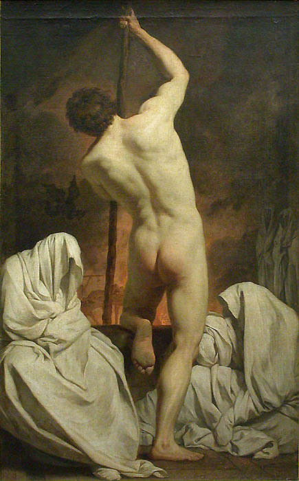
Charon carries souls accross the Styx, c. 1735/1744, oil on canvas
by
Pierre Subleyras
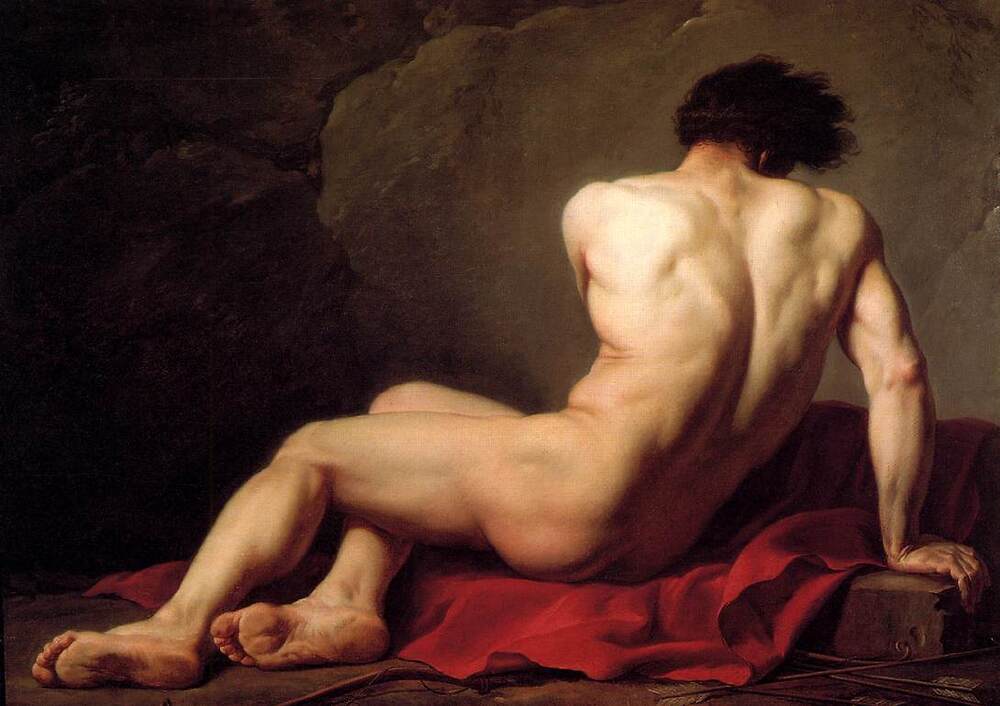
Patroclus, 1780, oil on canvas, 122×170cm (48×77in)
by
Jacques-Louis David
The following pieces by Franklin Booth depict the figure itself quite succinctly. But the penmanship, style, subject handling, composition, are all exquisite. Bear in mind that those were 1920s advertisements, literally.
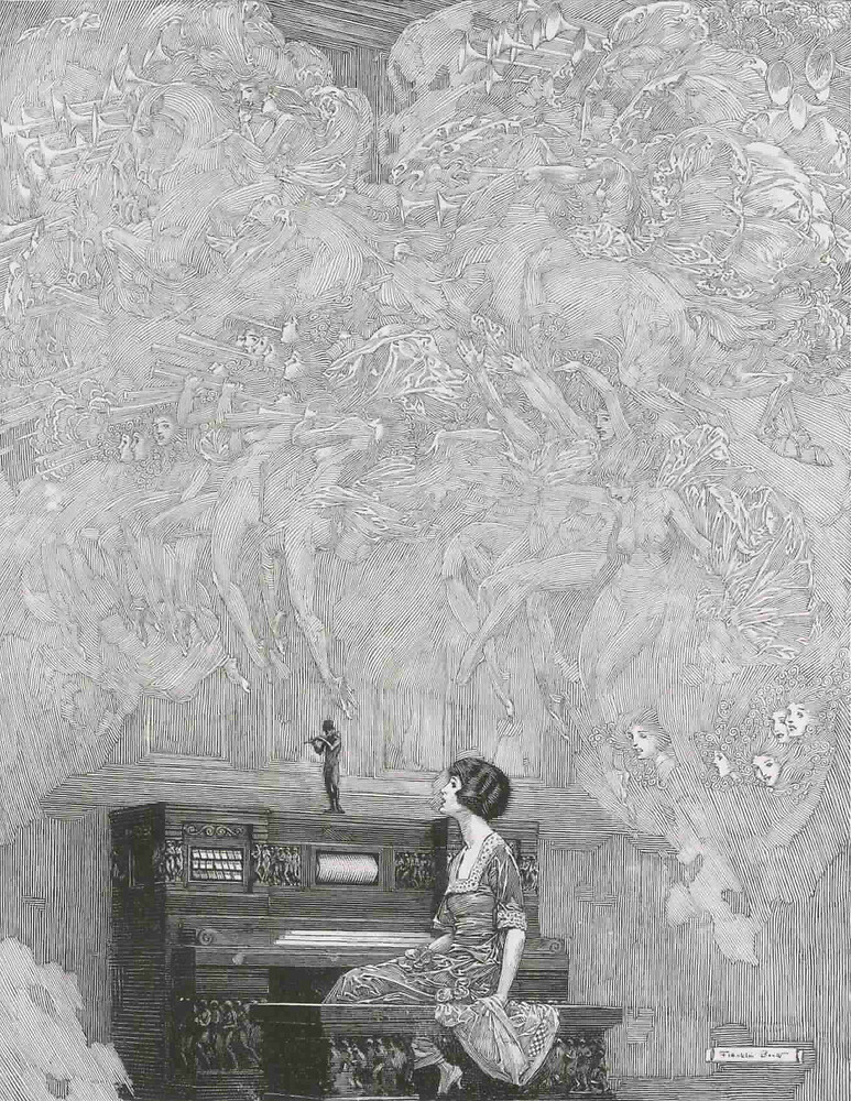
Advertisement for Estey Organ, House & Garden, the largest manufacturer of organs in the United States, 1922 (cropped)
by
Franklin Booth
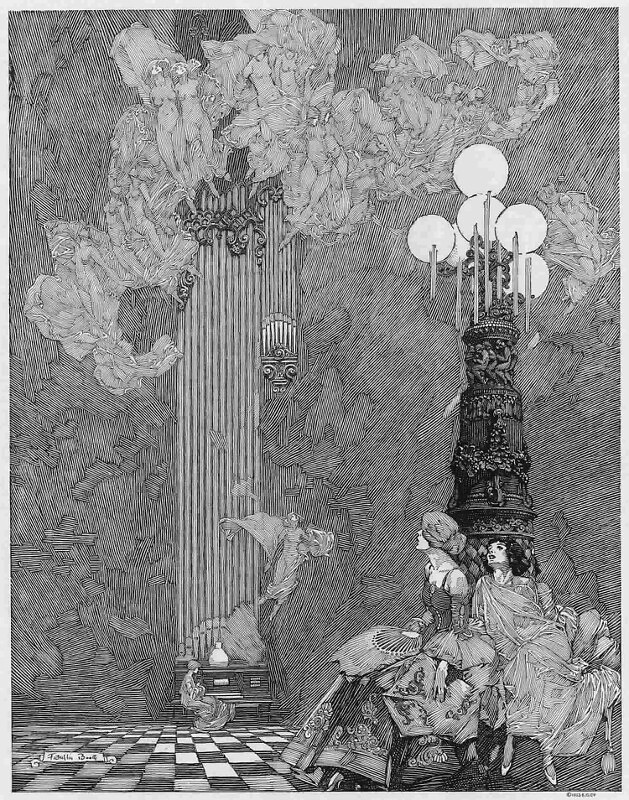
Advertisement for Estey Organ, House & Garden, the largest manufacturer of organs in the United States, 1923
by
Franklin Booth
The story goes that Booth learnt to ink by copying engravings, thinking the work has been performed with a quill.
Note: More illustrations from Booth can be found here or here.
It would be difficult to conclude on finished pieces without mentioning Bouguereau (1825-1905) or Gérôme (1824-1904), who may have reached an utmost degree of technical perfection regarding the figure’s rendition with oil paints, admired by many contemporary students of fine art.
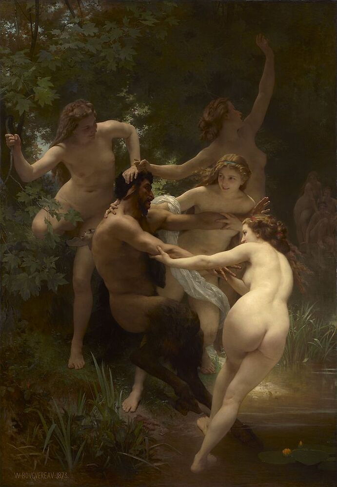
Nymphs and Satyr, huile sur toile, 1875, 260×180cm (102×71in)
by
William-Adolphe Bouguereau
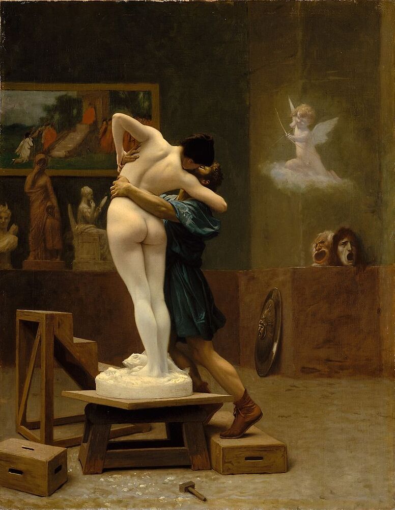
Pygmalion and Galatea, 1890, oil on canvas, 89×69 cm (35×27 in)
by
Jean-Léon Gérôme
Exercise
The content of this article is rather dense, and contains various tips and tricks regarding on how to draw the figure: can you sketch in one or two sentences such a method from what has been presented here?
Clearer answers will be provided in later articles.
Comments
By email, at mathieu.bivert chez: