Composition is the key to a pleasant painting; proper lighting ennobles to the eyes even the most modest subjects. The study of composition is a way to understand why something is, or isn’t, beautiful.
In essence, the rules of composition reflect either the inner-working of human vision and/or archetypal natural structures, like our eyes being attracted to strong contrasts, repetition of similar shapes in vegetation, or the common grouping/alternation between warm (orange-ish) and cool (blue-ish) colors.

Leaves, 2018, Toulouse, France
by
M. Bivert
Composition’s principles don’t limit themselves to the artwork, but also applies to an artwork’s presentation: a poor quality artwork can be improved by its surroundings; a greater artwork can be lessened by its surroundings.
Actually, composition’s rules flow far beyond fine art, and applies to cinema, dressing, advertisement, etc. For instance, the straight lines of a suit emphasize a strong character, while rounder clothing conveys a softer personality.
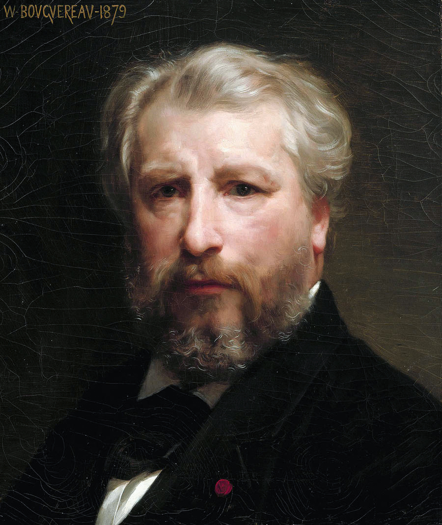
Self-portrait, oil on canvas, 1879
by
William-Adolphe Bouguereau
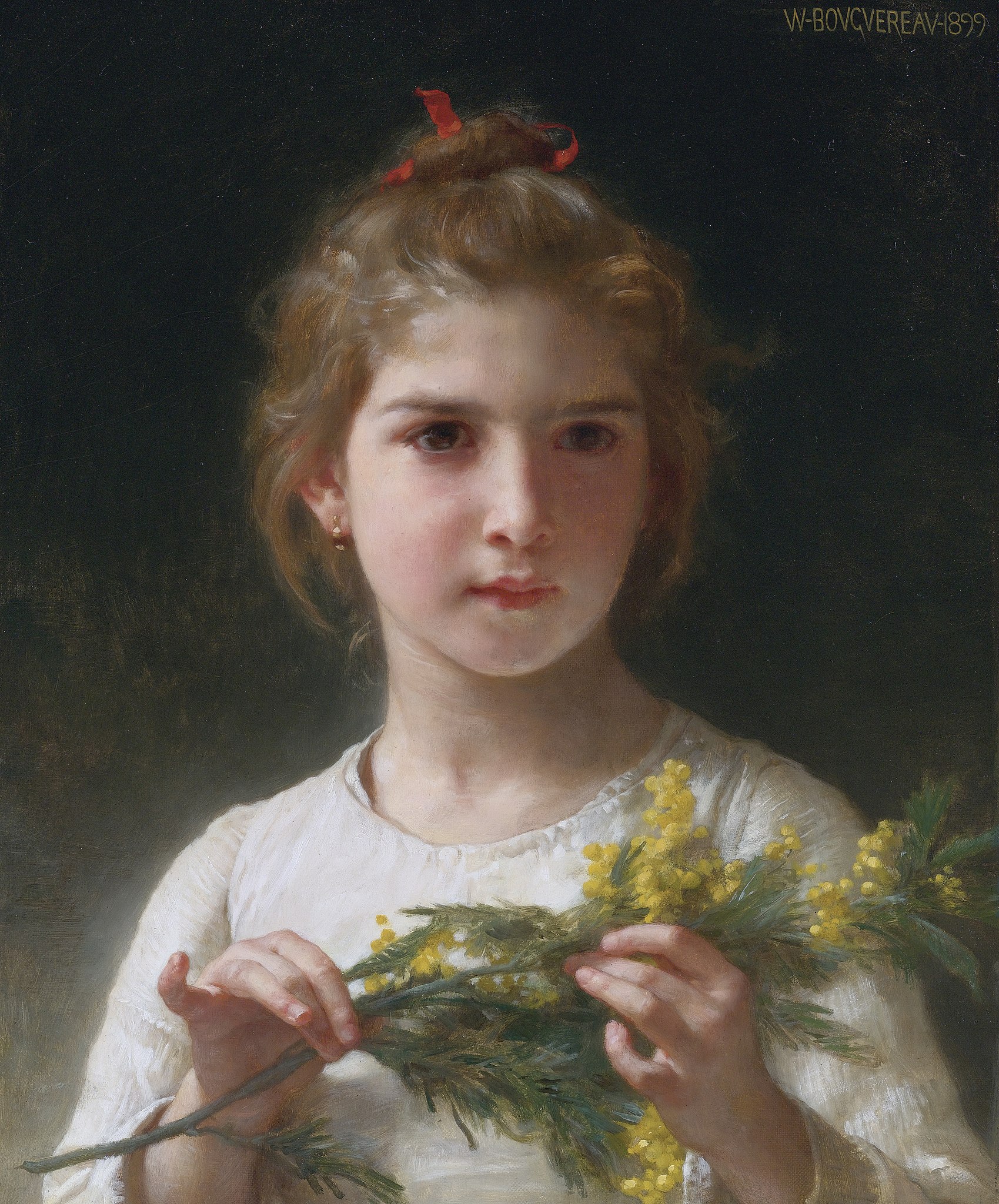
Mimosa, oil on canvas, 1899
by
William-Adolphe Bouguereau
Visual composition
While an in-depth exploration of the subject could take a book, we’ll simply glimpse here at two major elements of visual composition, both drawn from Nature.
For curious minds, additionals resources are provided at the end of this article.
Contrasts
The first one is that our eyes are attracted to strong contrasts As an archetypal example, when talking to someone, we tend to look at their eyes, in part because it’s an area of strong contrasts.
Note: People have been scientifically studying that instinctive behavior; see for instance:
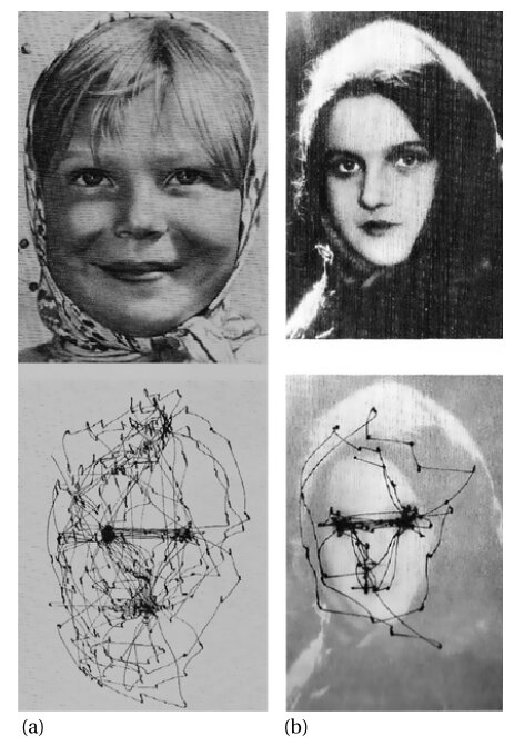
Cyclic fixation behaviour while viewing faces. (a) “Girl from the Volga”, viewed with no instructions for 3 min. (b) a girl’s face viewed with no instruction for 1 min. From Yarbus Eye Movements and Vision, 1967, figures 114 and 115, reproduced in Yarbus, eye movements, and vision, dx.doi.org/10.1068/i0382 (pdf), Tatler & al – likely, available for fair use
They usually occur between the dark pupil/the shadows casted by the brow ridge and by the upper eyelid, and the light reflected by the wet surface of the eye.
In the following example, this value contrast is enhanced by a subtle chroma contrast: the blue of the eyes is the most chromatic (that is, the less grayish/brownish) color of the painting. That chroma contrasts is furthermore a temperature contrast: the cool blue contrasts with the overall warm (brownish) tone.
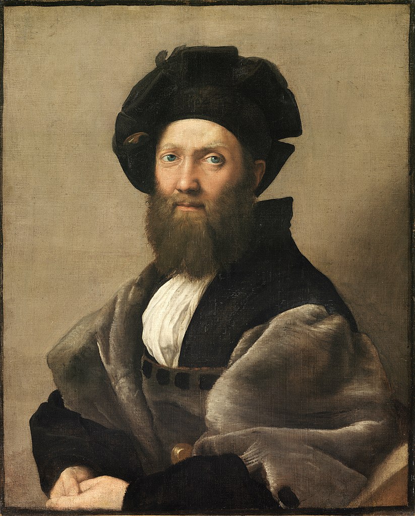
Portrait of Baldassare Castiglione, oil on canvas, probably Winter 1514–1515, Paris, Louvre
by
Raphael (Raffaello Sanzio)
Our appeal for temperature contrasts is likely to come from our daily exposure to our two main light sources: the warm sun, and the diffused light from the blue sky, which is a duller source of light, as perfectly exposed on the side shadows of this ox:
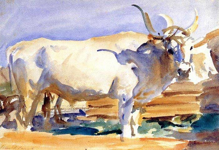
White Ox at Siena, watercolor, 1910
by
John Singer Sargent
Note: Lines, especially sharp lines, are a special kind of strong contrast. Painters tend to use them to guide the eyes of the viewer, to tell a story, or to visually unify distinct elements.
In the following, the road, river and mountains guide the eye to the light shining on the water (strong contrast); the vertical ruins and the two main trees “frame” that same area.
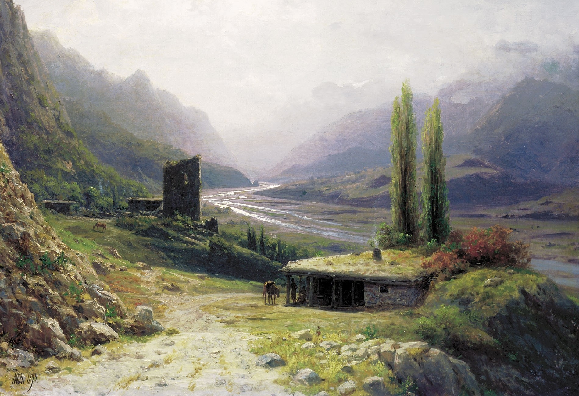
A Caucasian Gorge, oil on canvas, 1893
by
Lev Lagorio (Лев Феликсович Лагорио)
Unity in diversity
The second one is that harmony is often created by having unity through diversity.
A painting with no diversity is boring; one with no unity is chaotic, noisy. An artist needs to balance both to create a pleasant piece.
Flowers, trees, vegetation overall, clouds, mountains all exemplify that principles: they look alike, yet all are differents, and theirs parts still respect that rule:
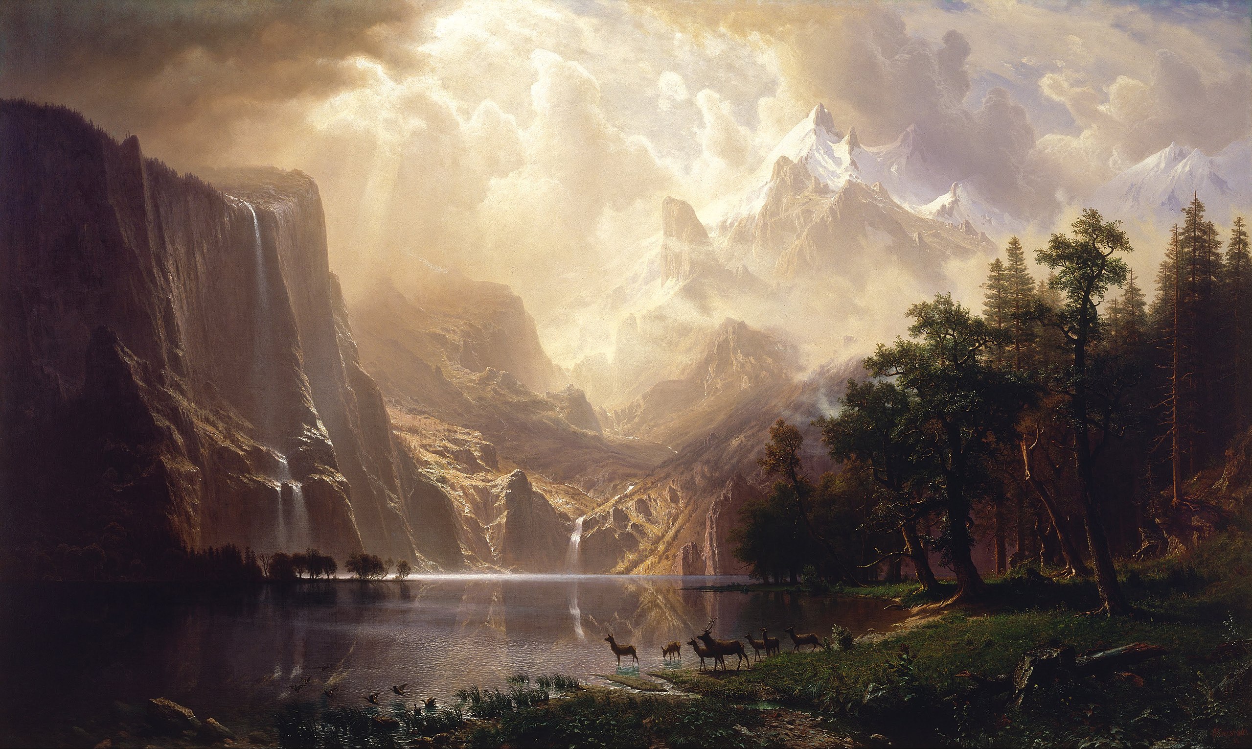
Among the Sierra Nevada, California, oil on canvas, 1868
by
Albert Bierstadt
And, voluntarily or not, humans may use that principle to arrange still lifes, buildings, paintings, pictures, gardens, etc.:
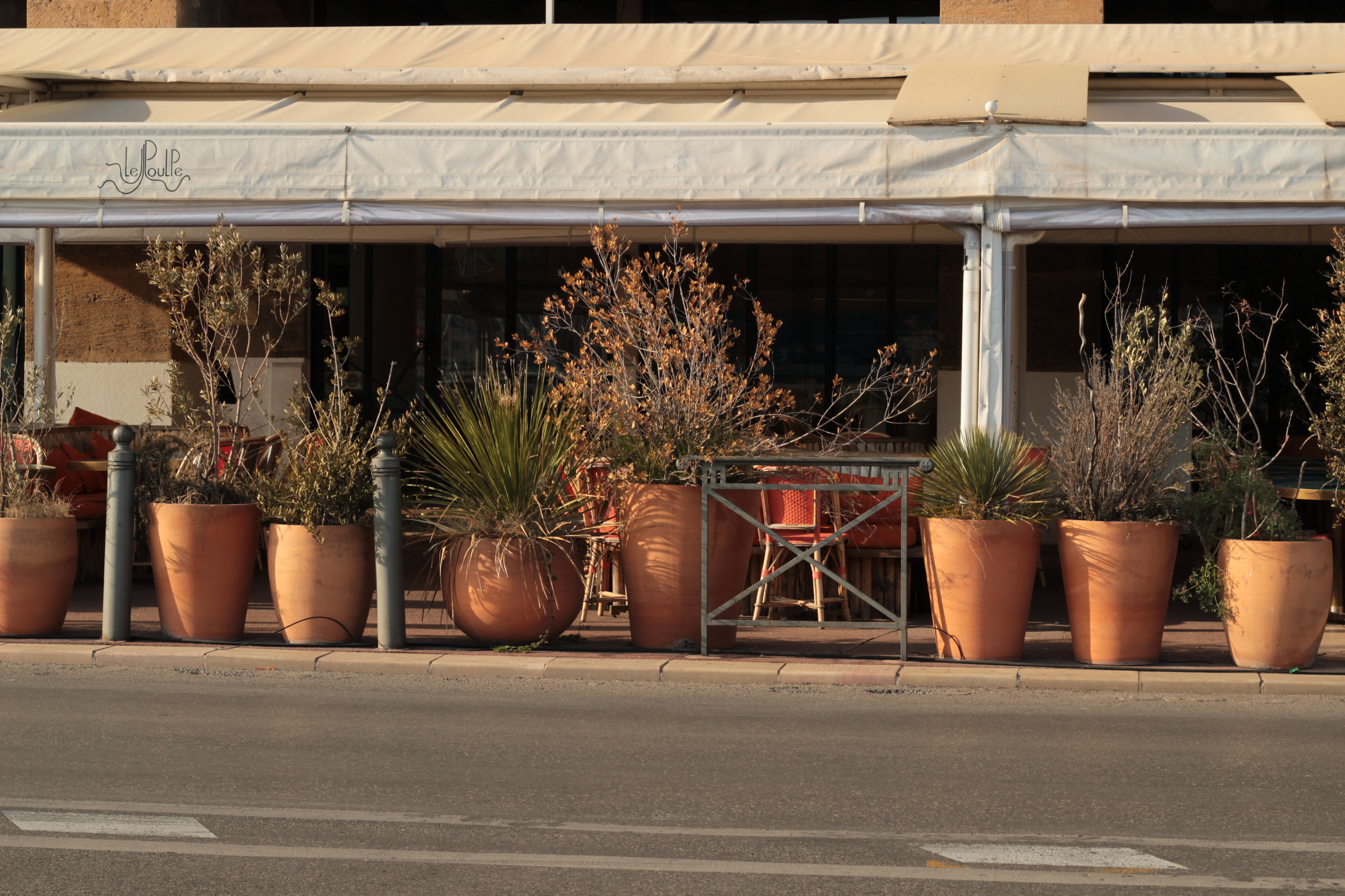
Vases, 2019, Marseille, France
by
M. Bivert
Semantic composition
Besides visual, superficial composition, there’s also a semantic layer of appreciation, that one can also find for instance in written Chinese language.
Note in the following the contrast between the grandeur, everlasting beauty of Nature and the smallness of Man, the ephemeral aspect of war:
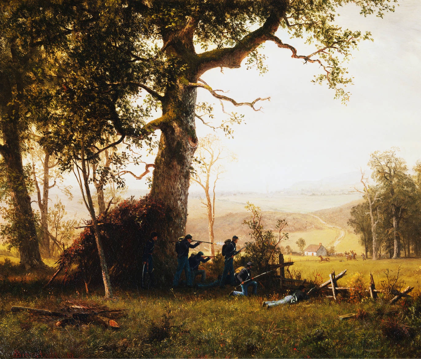
Guerrilla Warfare, oil on canvas, 1862
by
Albert Bierstadt
A key “issue” in the semantic realm is the broadness of interpretation: we can extract all kind of meanings from the elements of a painting, which is by the way, a major selling point of abstract art.
As such, it’s often preferable to narrow the scope of interpretation, for instance considering the main philosophical/religious currents that could have impacted the author, see for instance some interpretations proposed for Botticelli’s Birth of Venus.
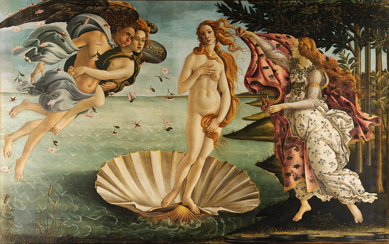
The Birth of Venus, tempera on canvas, c. 1485
by
Sandro Botticelli
Examples, resources
visual-arts-cork.com analyses and relates the composition of many famous works, while drawpaintacademy.com proposes a technical article on the matter.
Eric Bess often analyses famous artworks through The Epoch Times articles.
Budding artists could try to follow Arthur Wesley Dow (1857-1922)’s book (freely available), or Jack Hamm (1916-1996)’s one.
Nathan Fowkes explores the matter through colors on a (free) video series on YouTube, and, for a fee, proposes more advanced/complete material on Schoolism.
Ian Roberts proposes many videos on the topic on his YouTube channel.
Noah Bradley provides a landscape composition course, and plenty of other related content, such as critiques, on his YouTube channel. And so does Jordan Grimmer, again on his YouTube channel:
Finally in here, we also propose a few composition studies:
Comments
By email, at mathieu.bivert chez: