Pigment qualities
Lightfastness (permanence)
Perhaps the most important quality: lightfastness evaluates the durability of the paint over time. PR101 (iron red oxide/venetian red/indian red , PR101 (artiscreation.com), PR101 (handprint.com)) for instance is relatively durable, the indigo dye used for coloring (blue) jeans, isn’t. In the following, the Tuareg’s tagelmust is tinted with indigo, while the sand’s color is likely caused by iron oxide impurities in quartz crystals.
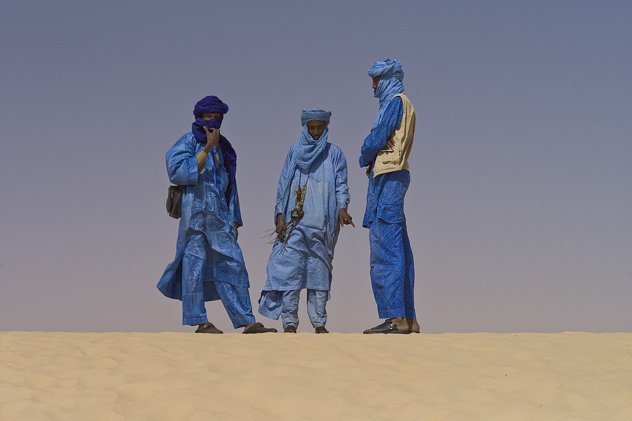
Touaregs at the Festival au Desert near Timbuktu, Mali 2012
by
Alfred Weidinger
Note that pigment’s lightfastness can be altered by external factors: for instance, lead white, while quite durable on its own, can be affected [pdf] (darkened) by modern pollution (sulfur).
Granulation
A second noticeable quality is granulation: some pigments, especially blues (cerulean, ultramarine, cobalt) and some earth (sienna, umbers) create a characteristic texture, especially on non-smooth papers
Mixing such colors, can create interesting effects: for instance, when drying, a green made from mixing cerulean blue with some yellow will tend to separate the blue from the yellow on the paper, more or less randomly, thus creating a peculiar texture and a partially optically mixed green.
Various manufacturers have plenty to say on the matter:
Opacity, transparency
Perhaps less visible to an untrained eye than granulation: some pigments will be more transparent than others. The archetypal example being white, PW6 (titanium white , PW6 (artiscreation.com), PW6 (handprint.com)), but cadmiums such as PY35 (cadmium yellow , PY35 (artiscreation.com), PY35 (handprint.com)) or PR108 (cadmium red , PR108 (artiscreation.com), PR108 (handprint.com)) are common examples too.
The use of opaque pigments, especially white, is sometimes frown upon by some watercolorists; for others, they are a convenience: white can be much easier to use than the infamous masking fluid. See for instance below a painting by Anders Zorn: by looking closely, we can see that opaque white paint was at least used for the sky light reflected by the foreground waves:
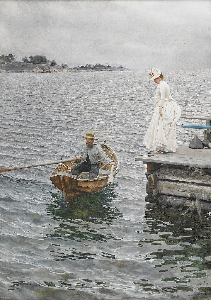
Summer entertainment, 1886, watercolor on paper
by
Anders Zorn
Staining
Some pigment like PR122 (quinacridone magenta , PR122 (artiscreation.com), PR122 (handprint.com)) are considered to be staining. As for other properties, the intensity can vary from pigment to pigment.
Practically speaking, staining pigments will stain the paper, thus, for better or for worse, making them more difficult to remove, e.g. with an “eraser” brush. Non-staining pigments will be easier to remove, but this also mean that they will be more sensitive to being disturbed when layering.
Tip: palettes, plastic or metal, can get stained by such pigments. They can usually be cleaned with either a regular eraser, or with 90° alcohol.
Colors
For a budding artist, using a limited palette is recommended. Experienced artists often do so to help create a mood. A complete set of colors allows for subtle usage of specific pigment properties, such as high-chroma subjects accurate depiction, typically for botanical art, granulation or staining control.
The list here is incomplete, based on personal experience, and aim at giving the reader an idea on how to grossly evaluate paints and propose a reasonable selection of permanent pigments, covering a great deal of the color wheel.

A modern digital version of Newton’s color wheel
by
-donald-
You can see a little “[+]” after each pigment name (e.g. PB29 (ultramarine blue , PB29 (artiscreation.com), PB29 (handprint.com), PB29 (kimcrick.com))). On click, you’ll see links to handprint.com and/or artiscreation.com’s pigment index, which provides plenty of additional details on the related pigment. You usually will want to refer to such websites before buying paint.
The pigments listed here are most often evaluated as “most lightfast” by manufacturers, ASTM and handprint; I haven’t personally evaluated them.
Blues
Ultramarine (synthetic lapis lazuli)
PB29 (ultramarine blue , PB29 (artiscreation.com), PB29 (handprint.com), PB29 (kimcrick.com)) is a warm blue pigment, with plenty of “advantages” (some really are characteristics, that may or may not correspond to what you want):
- provides a wide value range;
- permanent;
- highly chromatic;
- transparent;
- granulates noticeably;
- cheap;
- non-staining;
Because of its high-chromaticity, it allows the mixing of a decent range of purples and greens; mixed with an orange-ish brown provides a nearly perfect, cheap neutral gray.
Cerulean (cobalt)
PB35 (cerulean blue , PB35 (artiscreation.com), PB35 (handprint.com), PB35 (kimcrick.com)), or PB36 (cerulean blue , PB36 (artiscreation.com), PB36 (handprint.com)) is a light blue, granulating, highly-chromatic cool blue. It’a great way to extend PB29 (ultramarine blue , PB29 (artiscreation.com), PB29 (handprint.com), PB29 (kimcrick.com))’s mixing abilities regarding greens. It actually comes in a variety of shades, including some lending far more toward turquoise than others.
Permanent, relatively expensive.
Cobalt teal
Rapidly, PG50 (cobalt teal , PG50 (artiscreation.com), PG50 (handprint.com), kimcrick.com) provides an chromatic blue-green (teal, turquoise), a shade that can sometimes be provided by PB36 (cerulean blue , PB36 (artiscreation.com), PB36 (handprint.com)). Some artists use it more than others; it’s often use to convey the shade of backlit waves:
Also permanent and relatively expensive.
Cobalt blue
PB28 (cobalt blue , PB28 (artiscreation.com), PB28 (handprint.com), PB28 (kimcrick.com)) is relatively similar to PB29 (ultramarine blue , PB29 (artiscreation.com), PB29 (handprint.com), PB29 (kimcrick.com)). Main differences are:
- more expensive;
- slightly cooler;
- some tests seem to indicate greater lightfastness.
Phthalo blue
PB15 (phthalocyanine blue , PB15 (artiscreation.com), PB15 (handprint.com), PB15 (kimcrick.com)) is a relatively versatile blue, that can be used as a cheaper chromatic alternative to the aforementioned cobalts (cerulean/blue/turquoise). A key aspect to keep in mind is that it is a pungent, staining color, which requires to be handled with care. It can be a hassle in plein-air oil painting for instance, where a little bit of it will easily gets everywhere.
Its lightfastness has been reported as inferiors to cobalts by the ASTM, but not everyone agrees.
Yellows
Yellow ochre, raw sienna, raw umber
Those tree pigments are all low-chroma yellows:
- Opaque: PY43 (yellow ochre , PY43 (artiscreation.com), PY43 (handprint.com));
- Transparent: PY42 (raw sienna , PY42 (artiscreation.com), PY42 (handprint.com));
- Low-chroma, basically a yellowish brown: PBr7 (raw umber/raw sienna/burnt sienna/burnt umber , PBr7 (artiscreation.com), PBr7 (handprint.com)).
All are cheap, permanent, and can be used to to mix a wide range of low chroma greens. Note that PY43 (yellow ochre , PY43 (artiscreation.com), PY43 (handprint.com)) was the yellow used in the Zorn palette, and that the naming proposed here is arbitrary: some manufacturers will call PY42 (raw sienna , PY42 (artiscreation.com), PY42 (handprint.com)) an ochre for instance, or PBr7 (raw umber/raw sienna/burnt sienna/burnt umber , PBr7 (artiscreation.com), PBr7 (handprint.com)) raw sienna.
Cadmium
Cadmiums are opaque, highly chromatic, strong, permanent pigment, often avoided for their advertised toxicity. Nevertheless, they offer difficult to match performances. As far as the yellows are concerned, PY35 (cadmium yellow , PY35 (artiscreation.com), PY35 (handprint.com)) often comes in various shades, such as “citron” (a cool variant) or “medium (a warm version).
The cool ones are especially useful to mix bright greens when combined with e.g. PB35 (cerulean blue , PB35 (artiscreation.com), PB35 (handprint.com), PB35 (kimcrick.com)). The warmer one, obviously for mixing oranges, or to help provide that golden color typical of late evenings and early mornings.
Cadmiums being strong colors, when mixing, add them little by little. This is especially true when mixing low chroma dark mixture, where the strength/opacity of the cadmiums can easily mess things up.
Nickel azomethine yellow
PY150 (nickel azomethine yellow , PY150 (artiscreation.com), PY150 (handprint.com)) is a great transparent, permanent, “medium-chroma” yellow (it must be the highest-chroma permanent transparent yellow out there). Especially useful to get dark chromatic greens, where the opacity/strength of the cadmiums wouldn’t be suitable, and where ochres are not chromatic enough.
Reds
Venetian red, burnt sienna, burnt umber
As for the yellows, those three are low-chroma reds, cheap & permanent. “Venetian red” or “Indian red” often refer to an opaque color; “burnt sienna” or “transparent red oxide” to a transparent version of a similar color. Burnt-umber is a low-chroma, orange-ish version of it. Pigments involved are:
- PR101 (iron red oxide/venetian red/indian red , PR101 (artiscreation.com), PR101 (handprint.com))
- PBr7 (raw umber/raw sienna/burnt sienna/burnt umber , PBr7 (artiscreation.com), PBr7 (handprint.com))
Again, when buying paints, look for the pigments and the advertised transparency degree, as the naming is arbitrary.
Note: Iron oxides are basically rust:
Quinacridones
Quinacridones pigments offer a great variety of cool, permanent, transparent reds, pinks and magentas. They are especially useful for botanical art.
- PR122 (quinacridone magenta , PR122 (artiscreation.com), PR122 (handprint.com))
- PR209 (quinacridone red/quinacridone coral , PR209 (artiscreation.com), PR209 (handprint.com))
- PV19 (quinacridone rose/quinacridone red , PV19 (artiscreation.com), PV19(B) (handprint.com), PV19(R) (handprint.com))
While generally considered permanent, some caution is required; usually, bright transparent reds & roses are some of the most troublesome pigments, regarding transparency.
Cadmium
As for the yellows, PR108 (cadmium red , PR108 (artiscreation.com), PR108 (handprint.com)) offers an hard to match performance regarding lightfastness, strength and chroma for a warm, opaque red. Same precautions regarding mixing apply (becauseof its opacity).
Greens
We’ve already cited PG50 (cobalt teal , PG50 (artiscreation.com), PG50 (handprint.com), kimcrick.com) as a green pigment, in the blue section. There are other green pigments, but a lot of painters prefer to mix them: out-of-the box greens often have an unnatural feel to them and almost always need to be adjusted; mixing them is not that as troublesome as it may seem.
Note: Trees are a great training ground in that regard.
White
There’s a saying about how genuine watercolorists shouldn’t use white, and solely rely on paper’s transparency. However, for practical reasons, and/or/such as to avoid using masking fluid, many artists did and still do use white, more or less sparingly, depending on the artists.
The following by Sargent is build mostly from transparent washes, but you can notice the use of small touches of white on the gondoliers’ clothes:
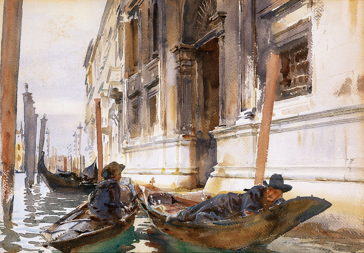
Gondoliers’ Siesta, c. 1904
by
John Singer Sargent
Using white sometimes can be much more convenient, whether for mixing some colors, to contrasts transparency with opacity, or for small details. The difference visually is close to negligible; furthermore, an opaque pure white can help bring a little bit of depth on highlights.
Neutral tint, black
Black is often discouraged for shading, especially for beginners, who lack awareness of the subtle qualities of black: most blacks are actually very dull blue, and will shift the paints chroma towards blue, which often needs to be corrected (e.g. with a bit of brown). This is a common cause of “muddy” colors in students’ works.
A common shortcut is the use of a neutral tint, that is, a “black” that is more neutral from a chromatic point of view, and that won’t “dirty” color mixes. It’s quite a convenient color to use, especially when doing plein-air. Many painters actually don’t use a premixed one but mix one with a dark blue (PB29 (ultramarine blue , PB29 (artiscreation.com), PB29 (handprint.com), PB29 (kimcrick.com))) and a dark low chroma orange (which is a fancy way of saying “a warm brown”, for instance one made out of PBr7 (raw umber/raw sienna/burnt sienna/burnt umber , PBr7 (artiscreation.com), PBr7 (handprint.com))).
Depending on manufacturers, you may not get a perfect neutral mix, but this should gets you far enough (mixing a neutral tint is beyond the scope of this article, but if your brown is too cool, try adding a small touch of red).
On a similar note, Daniel Smith has developed a line of three neutral greys or different color temperature with/for Joseph Zbukvic.
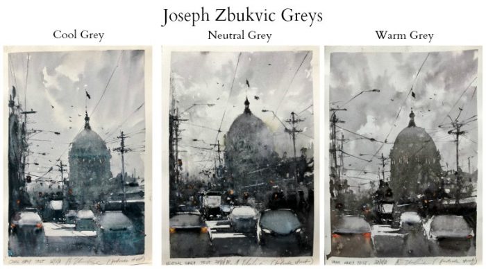
Demonstration of Daniel Smith’s ‘Z’ neutral greys
by
Joseph Zbukvic
Comments
By email, at mathieu.bivert chez: