Introduction
Note: This is a WIP; I’ll slowly add to this article over time, and probably restructure it later once I’ve got most of it down.
Painting is complex enough of an activity to require a precise adjustment of many bolts and nuts to systematically achieve a predictable result. I’ll try to document here a few things pertaining to oil painting that I’ve learned over the years.
You may also be interested in this series about watercolor material.
The rule of thumb
This really cannot be understated, especially for oils, even more so for beginners:
Keep it simple.
In particular, make a habit of not reaching out for new or fancy material or technique; instead take the time to thoroughly understand the problems you’re facing, and try to solve them as simply as possible, preferably with what you have at hand.
There are two reasons for this:
- The more tools you have, the more you’ll have to learn;
- It’s important to develop a problem-solving mentality, because the learning/painting processes often consist in finding simple and/or creative solutions to many little issues. For example, the corners of a big square brush can help achieve details, without the need to rely on a smaller brush.
Example: Here’s an experiment I’ve made recently, after a long hiatus of not using oil. It’s a bit rough, and the quality of the photos is limited, but it’s 1) just practice 2) good enough to illustrate the mindset.
The goal was to use a transparent PR101 (iron red oxide/venetian red/indian red , PR101 (artiscreation.com), PR101 (handprint.com)) to make a monocromatic still life using a single, big, student-grade hog-bristle brush, and a rag, on a random cheap surface.
I was using a plywood panel, swiftly coated at least twice with acrylic gesso (I don’t remember exactly, but that’s usually what I go for). That kind of coating is very absorbent: getting back the lightest values by swiping the paint with a rag was impossible.
The out-of-the-tube paint was furthermore quite oily: dark values were then also difficult to achieve, as the bristles tend to prevent the paint from accumulating. Using the brush on the side was softer on the paint, and helped in this regard.
To get the light values back, I tried using solvents (e.g. turpentine), but those are annoyingly difficult to handle precisely, as they’ll cause the paint to dry almost instantly and create hard darker potato-shaped-rings.
Hence I choose to let it dry. To my surprise, it took much longer than expected because the tubed-paint contained a slow drying oil, safflower, added by the manufacturer probably to compensate for the natural tendency for PR101 (iron red oxide/venetian red/indian red , PR101 (artiscreation.com), PR101 (handprint.com)) to dry fast (touch-dry in a day or two), a tendency caused by the natural occurence of manganese, a siccative, in iron oxide.
Once it was finally touch-dry, I progressively scumbled some opaque PW6 (titanium white , PW6 (artiscreation.com), PW6 (handprint.com)) to retrieve the lighter values. IIRC, I used a smaller, rounded brush here. I left it there, but I could have pushed it (much) further (the goal was just to slowly get back to oils, not to create a Piece Of Art though).
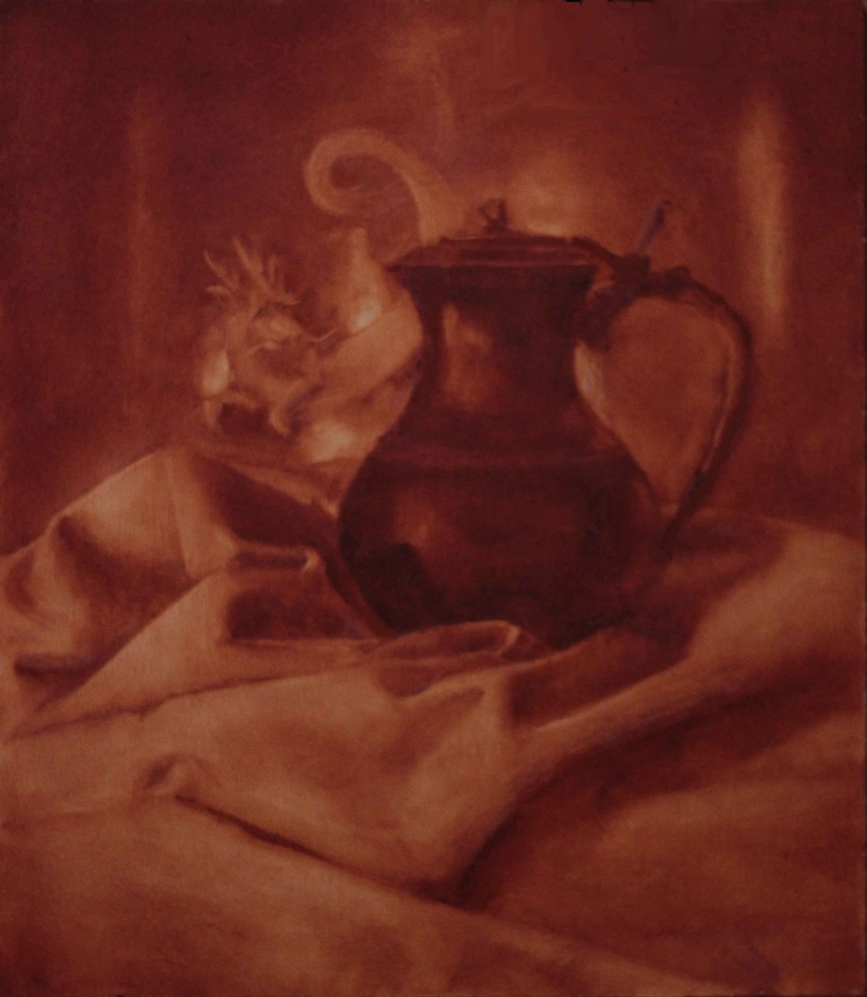
Transparent red oxide wash
by
M. Bivert
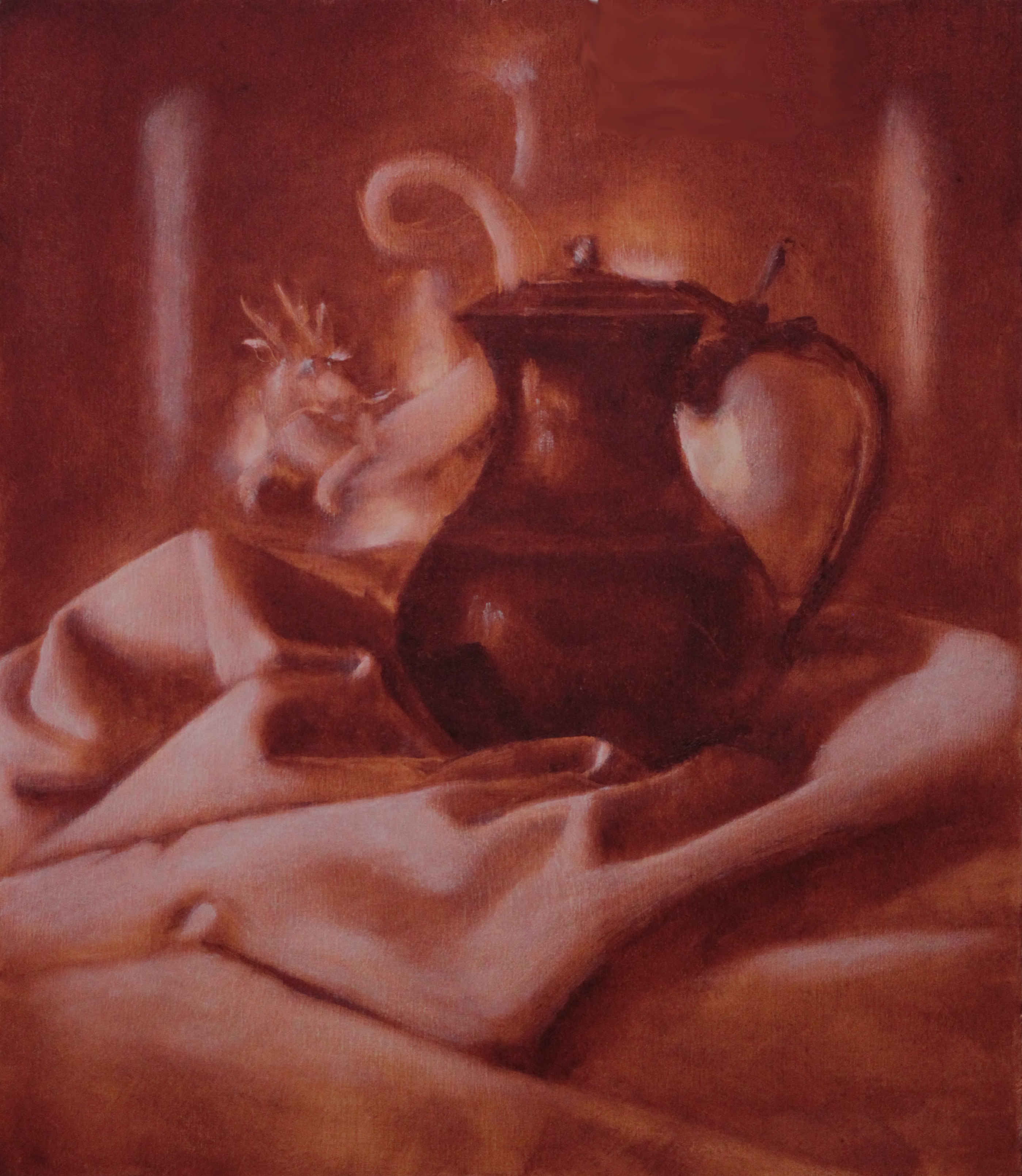
Transparent red oxide wash + white scumbling
by
M. Bivert
Oil isn’t as scary as it looks
Oil painting feels intimidating, but as far as painting is concerned (see the Note below), I’m convinced it’s actually the easiest painting medium. Here are a few reasons:
- It’s slow drying: you have time to mix/to learn to mix colors, an important step in your artistic education;
- It’s very malleable: you can scrap paint of the surface to a reasonable extent, you can let it dry and layer, you have plenty of time to shape the edges as you wish, etc.;
- Generally speaking, I believe the paint handling feels more intuitive than e.g. watercolors, because it matches more closely our sense of touch.
Note: However, the setup/cleanup processes are more involved than with, say, water-based paints. Some later tips will help reduce such annoyances.
Where to start
First and foremost, make sure you can draw well. It’s a good idea to dabble with paint early on, but don’t expect great results until you actually know how to draw well. To clarify, by “drawing” I mean essentially to achieve a fine control, with dry materials (e.g. graphite), over
- Proportions;
- Values to express form;
- Values for composition.
Those skills are easier to practice with something like graphite, and remain foundational when painting. That being said, as for starting with oils, pick:
- One brush;
- One specific surface;
- One pigment (tube of paint, really), to which you may or may not decide to add a white.
And try to make some (simple) monochromes (e.g. basic still life), at home (don’t bother with things like plein-air or working from a live model just yet; remember: Keep it simple). You’re likely to quickly encounter issues: try to solve them as simply as you can after having thoroughly analyzed the situation.
Once you can make those simple monochromes, you can progressively increase the complexity, e.g. experiment with:
- A variety of brushes (sizes, hairs, etc.);
- Different surfaces or surface preparations (papers, panels, oil grounds, acrylic grounds, etc.);
- More colors/pigments;
- Palette knives;
- etc.
Example: I’ve shown earlier an example of a monochromatic still life. Here’s another good monochromatic exercise: make a drawing on paper (not shown), transfer it to some a painting surface (how to transfer a drawing will be explained later), and render it with oils:
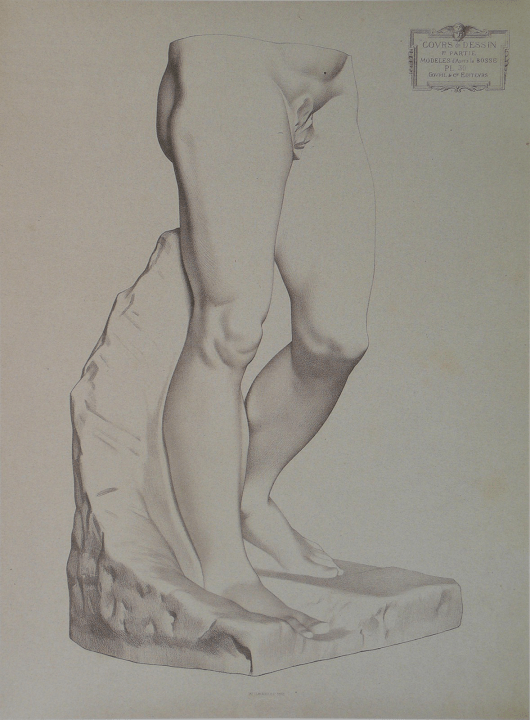
Plate I 30, Michelangelo’s Dying Slave’s legs
by
Charles Bargue
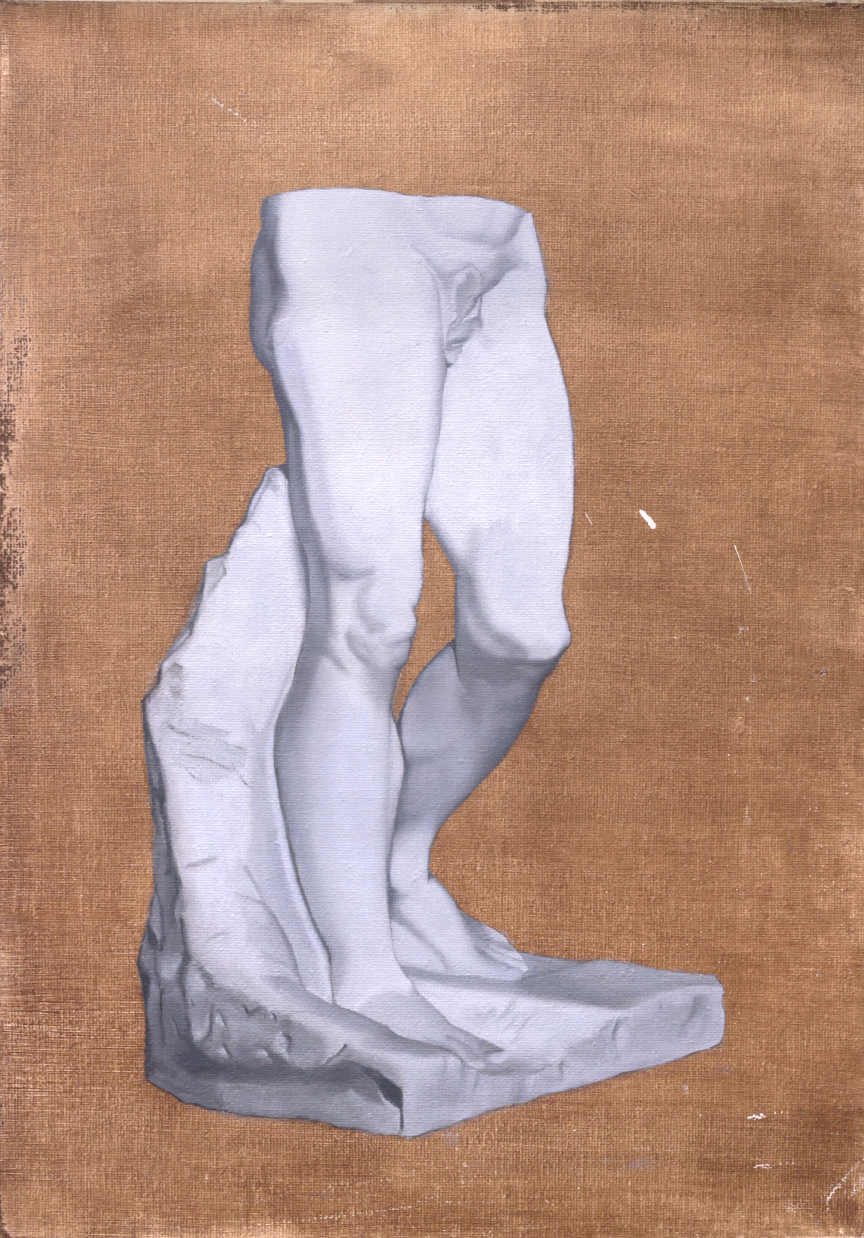
Bargue’s plate I-30 (“Legs of the dying slave”) copy. Black and white oils on a burnt umber washed canvas
by
M. Bivert
Oil paint is not more expensive than other forms of paint
I’ll address in this section the paint itself; some people might argue that the painting surfaces are more expensive: this will be discussed later (it’s essentially false, as a slightly thick drawing paper and two coats of acrylic gesso gives you a cheap, yet durable practice surface).
Paint is made mainly by mixing pigments,
colored powders, with a binder. In the
case of oil paint, the binder is a (“drying”) oil. In the
case of acrylic paint, the binder is an acrylic resin.
In the case of watercolor, the binder is water
generally gum arabic (eh).
Some additional elements can be added to alter the behavior of the paint, to help reduce the quantity of pigment (why is answered in the next paragraph), to prevent the pigments from separating from the binder too much, etc.
Now, price-wise, pigments are the ingredient contributing the most to the price of a tube of paint. So essentially, there’s no major price difference between oil paint and other forms of paint, as long as we compare the same pigment (and the same “grade” of paint, e.g. student grade vs. student grade, or artist grade vs. artist grade; more on that later).
Note: But you might ask, we can clearly see that some high-end acrylics are cheaper than oils made by the same manufacturers1. Yes! But that’s because the acrylic binder absorbs less pigments than oil, so highly pigmented acrylics will still be less pigmented than highly pigmented oils. Those additional pigments aren’t “lost” either: a little bit of more pigmented paint will go further.
Note: Another exception: the watercolor manufacturing process is quite involved, which makes them more expensive. For example, they are more expensive than gouache, despite the fact that the pigment load in (good) gouache is higher than in watercolors!
Note: This also explains the price / grade differences between different brands of oil paints:
- expensive paint uses expensive pigments;
- the higher the pigment load, the higher the price.
But more on that later.
Renaissance/old masters techniques
If you’re a beginner and think you need to focus on them, then you probably shouldn’t. I believe it’s a mistake to focus on this aspect early in your training; I’ll first explain you why I think this is, before giving you a proper answer.
Update: The day I’ve posted this tip, I’ve saw two posts on the Internet of beginners looking for that kind of stuff. I’m confident this really is common issue.
A hypothesis I have is that many of us lack field knowledge, and as a result have this kind of too simpfilied view that “painting” is either Renaissance/old stuff or contemporary nonsense, and hence we default to the former. Thus, I’ll try here to provide some of that field knowledge, to help you better understand my point.
-
The focus on painting technique is (usually) detrimental to more fundamental aspects of the craft.
In particular, as stated earlier, make sure that your drawing skills are well-polished (proportions, use of values for composition and form). You might be interested in Bargue’s course.
As stated in previous sections, as far as oil painting is concerned, it seems wiser to me to start with a simple setting (e.g. monochromatic still life or geometric forms), and progressively increase technical/subject complexity, so as not to get overwhelmed.
-
The painting technique back then was not necessarily superior to what came after: some of it was experimental (e.g. Leonardo’s Last Supper), not always well-understood, and sometimes improved by later generations.
Consider for example:
- perspective was only recently discovered;
- there were almost no drawing/painting books/treatises;
- no Internet, no artificial light, not an abundance of cheap, highly chromatic and lightfast pigments (e.g. ultramarine), no tubed paint;
- early technique was still influenced by tempera;
- limited understanding of color mixing2;
- hand-ground pigments are coarser than what is now automatically achieved, thus affecting e.g. lightfastness, transparency, perhaps drying even;
- some previously ubiquitous pigments like PW1 (lead white/ceruse/kremnitz White , PW1 (artiscreation.com)) are now cumbersome to acquire in some regions of the world;
- etc.
The difference in practical circumstances is tremendous, and naturally encourages different approaches.
-
Exactly replicating the techniques is hard, in part because the modern understanding and material are too different (see the previous points again).
Alright, now for an actual answer. AFAIK, there are two/three main sources of knowledge regarding old techniques:
-
Journals of art conservation, museum issued papers, and more generally, research and academical work. I’ll give you more specific pointers quickly;
-
Studies and unfinished works, allowing you to decipher some aspects of the technique;
-
Painting treatises; bear in mind that most of the treatises, came after the Renaissance: in the early days, techniques were preciously safeguarded and purposefully not documented.
Two notables examples are Cennino Cennini’s Il libro dell’arte and Leonardo’s Treatise on painting
Unfinished académie performed while studying at Gérôme’s atelier
by
Gustave Courtois
Now it can be daunting to go through all of this on your own. Fortunately, some artists already went down this road, and made some of it more digestible. In particular have a look at Luis Borrero’s Youtube channel;
Another artist to look for is Lala Ragimov. Consider for example this page pertaining to Rubens’s materials (pay attention in particular to the bibliography: that’s the kind of journals that you’d be looking for where you to pursue this endeavor), and this other page containing some analysis and background information regarding a Rubens master copy.
Mediums
Don’t bother.
At least, that’s the best starting point. As mentioned in earlier sections, it’s best to keep it as simple as possible in the beginning, and to only add what you need.
Example: You’ll probably use PW6 (titanium white , PW6 (artiscreation.com), PW6 (handprint.com)) at some point, as it’s the modern white. The pigment is rather stiff: a little bit of extra oil (or any other medium) can be used to make it more workable.
Limiting medium use is not an uncommon advice: I would dearly recommend you to pay close attention to the following video by Alex Tzavaras; it’s about 80% of what you need to know about mediums.
Note: AFAIR, he doesn’t expand on liquin/alkyd resins, which I think deserve a few words (that’d be in a later section).
Cheap surfaces for practice
The cheapest surfaces you can get are slightly thick drawing paper, plywood or MDF, coated with acrylic gesso. I usually apply two coats, and sometimes when I feel fancy, I first seal the surface with a transparent acrylic binder (not sure if it really matters).
Naturally, both sides can be used.
Some people will even skip the gessoing (and the sealing): the oil will slowly eat the paper over the years, but for practice pieces, it’s good enough.
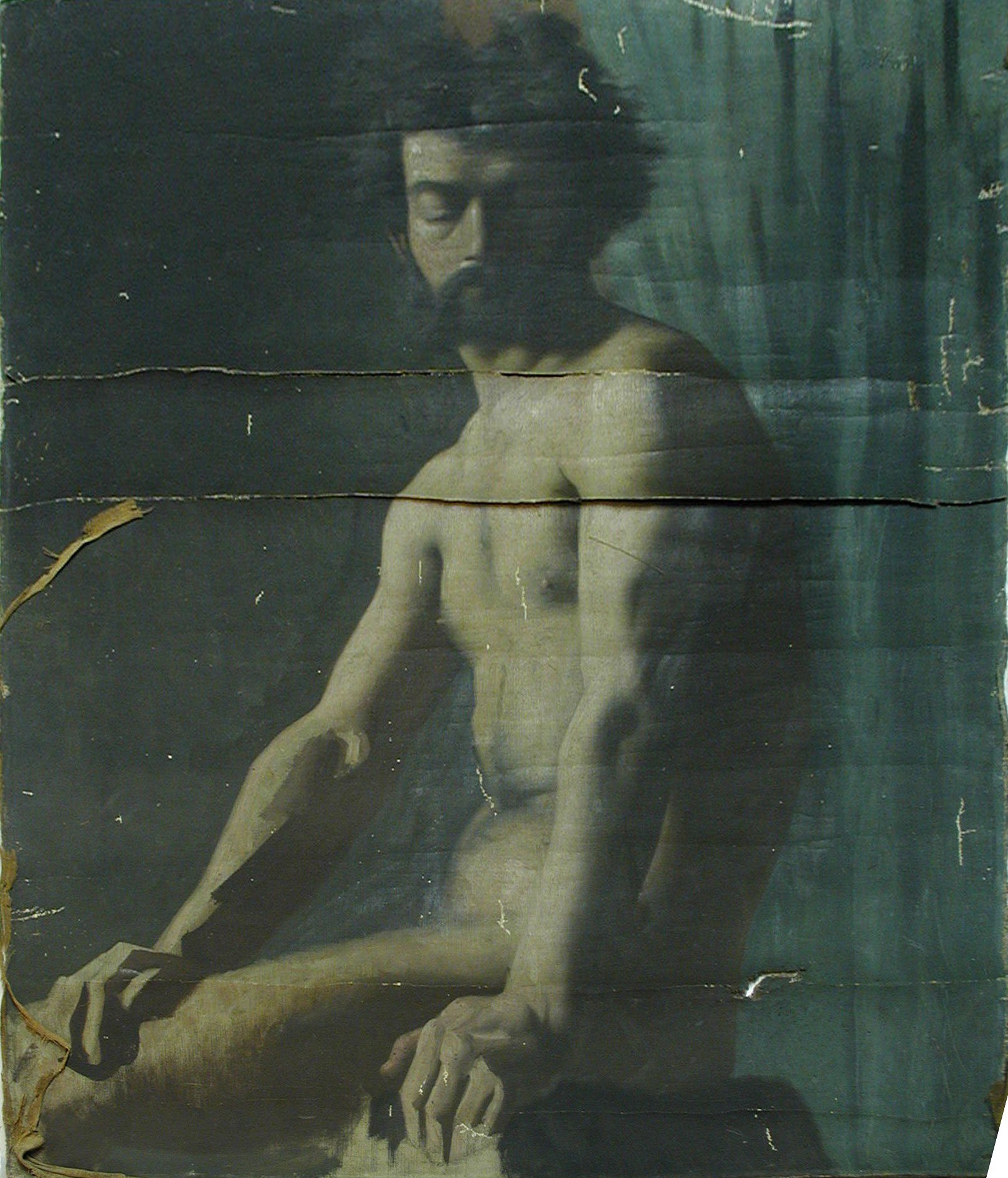
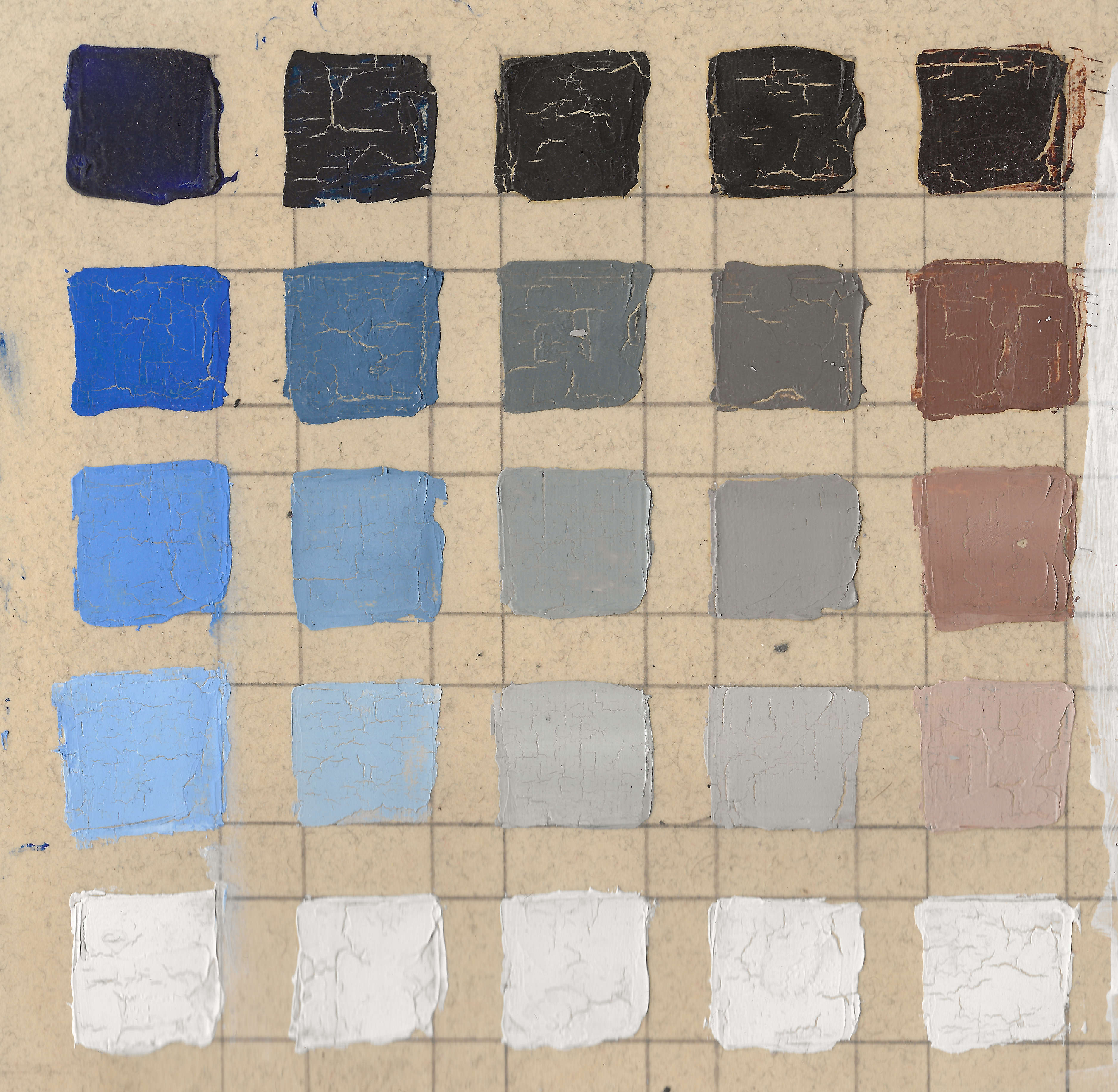
Note: Do not3 apply oil paint on a surface merely sealed with an acrylic binder: the oil will crack. Here’s a (very) old incidental example, on a manufacturer-tinted paper: the first image shows “thick” paint applied directly on the sealing. The second depicts mostly thin transparent paint (no white mixed-in) glazed on acrylic gesso4; the darkest values were still applied thickly to be as dark as possible, and still shows no cracks.
Now, acrylic gesso, yields an absorbent surface. If you have some Liquin/alkyd-based medium around, a convenient way to drastically reduce absorbency is to coat the gessoed surface with a mix of Liquin and white oil paint. Let it dry for a day or two (3 or 4 is probably better) before painting over it. For practice pieces, you can be heavy on the Liquin5.
Note: There are non-absorbent acrylic primers, like this one by Michael Harding. And “of course”, there are alkyd-based primers (instead of the previous ad-hoc solution).
Painting surfaces
Have a look at this article for a thorough discussion. Here’s what I’d consider the main takeaway (emphasis is mine):
So far, ACM oil painting panels appear to be the most stable supports available. They offer the greatest possibility of our paintings lasting hundreds of years without cracking or damaging the paint in any way. Not only will our paintings be around for our collectors’ lifetimes, but they can pass them on for generations to come as cherished family heirlooms.
The only drawback that I have seen is dropping a panel. […]
Copper panels can be an alternative with similar properties, and with a historical track record, but they are far more expensive. Plywood panels are cheaper, but more sensitive to temperature and humidity. Genuine wood panel are more expensive, rare and limited in size. MDF isn’t size-limited, but IIRC shouldn’t be expected to be remotely close to durable. A major advantage of canvases, is the essentially the arbitrary size but they can be cumbersome to prepare.
Note: The article’s author mentions that he hasn’t tried Arches oil paper (at least as of 2024-04-27). See the next section for a quick review.
Oil paper
Overall, I think it’s a great option for studies, plein-air and travels. For practice pieces, it may be more costly, but definitely less time-consuming than preparing gessoed paper; both sides can be used.
I’ll be discussing Arches Huile paper in particular6:
-
Quite absorbent;
-
Doesn’t require any further preparation (no need to seal it or gesso it);
-
Light and thin, compared to any panel or stretched canvas. Hence, it’s easy to transport and store;
-
Formulated for durability;
-
And also formulated to endure flawlessly heavy solvent washes;
-
Not that expensive (about 10€ for a 300gsm 56×76cm sheet);
-
Can be cut to arbitrary sizes;
-
In case you’re wondering, no, you can’t do watercolor on it. Well, you can, but it’s a nightmare, as the surface kinda repels water;
-
Which is an interesting property for plein-air: it can take some amount of rain without any buckling, or any other observable issue:
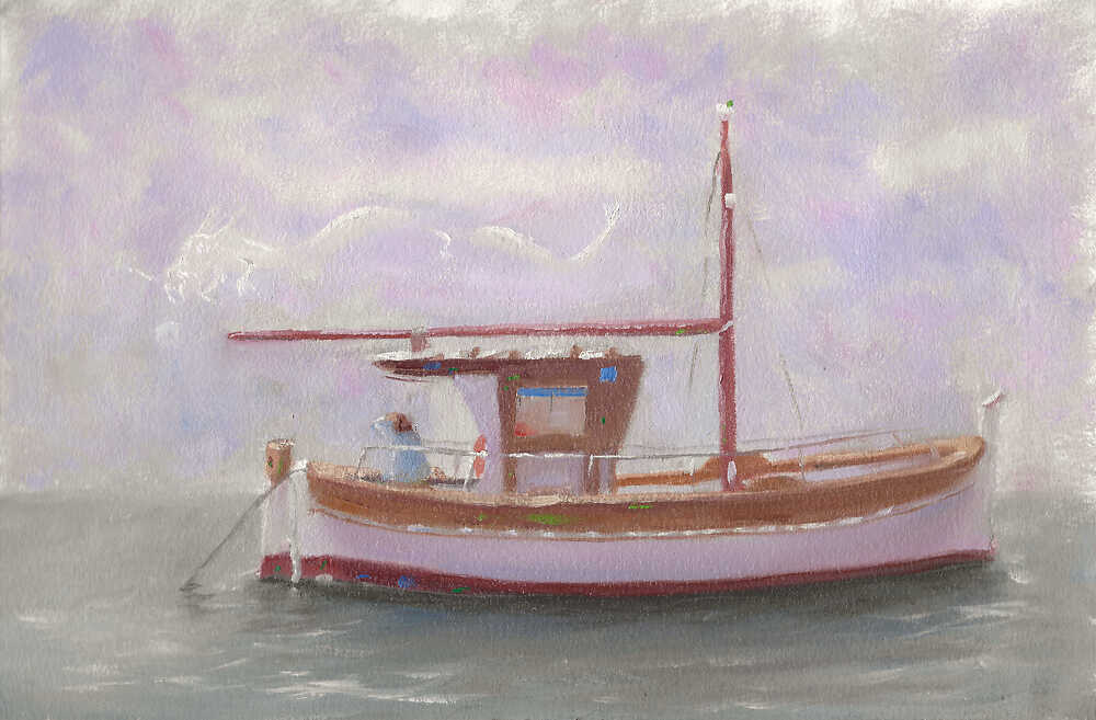
A small plein-air on Arches Huile paper, largely made under the rain (late march 2024); a boat on Marseille’s Vieux port (old port). by M. Bivert
through instagram.com

How to transfer a drawing
Use tracing paper, as you would for a drawing, but instead of applying a coat of graphite or charcoal dust on the back side, you can instead apply a thin coat of raw or burnt umber oil paint (PBr7 (raw umber/raw sienna/burnt sienna/burnt umber , PBr7 (artiscreation.com), PBr7 (handprint.com))). Be mindful of your alignements; in particular, you may want to transfer a plumb line and/or a horizontal line, to prevent undesired tilts.
A thin layer of umber is touch dry within a few hours. Graphite or charcoal aren’t as stable; a fixative can be used with those.
Here’s a variant of what I’m proposing. It avoids to transfer the drawing to an intermediate sheet, at the cost of affecting (expect a slight indentation) the surface of the (original) drawing. Any cheap thin paper can be used to hold the umber coat I guess (transfer paper, newsprint, etc.).
Note: Centuries ago, drawings were often fixed with ink. This means that you had to go through the drawing twice: a first time to transfer it, a second time to fix it. Because back then paper was expensive, the transferring process consisted in poking little holes on the drawing paper, following the lines of the drawing. One would then spread charcoal dust (or similar) through those holes to perform the transfer. Then you’d connect the dots with ink on the final surface.
Brush cleaning
The usual process for cleaning brushes is as follow:
- Rinse them thoroughly in a turpentine/solvent-filled jar;
- Use a cloth to soak the turpentine/solvent from the brushes;
- Clean thoroughly with soap and water. It’s best to soak the remains of paint+soap with a rag instead of flushing them down.
DO NOT go straight to soap and water, and dump the waste down the pipe: the wasted paint will slowly accumulate and dry, potentially clogging the plumbing in the end.
Note: After step 3, you know that the brushes are thoroughly clean when both:
- The soap isn’t tinted anymore;
- And the brushes don’t feel “greasy” to the touch. If they do, it means there’s still oil in there, and you need to use more soap to get it out. If you don’t, you’ll observe the brushes getting slightly stiff after a day or two: clean them while you can.
Note: I’ve had some “issues” in the past with a dammar-based medium: the dammar was accumulating in the turpentine jar, and contaminating the brushes. So you might want to use a two jars system, or learn to live with some dammar in your brushes (they get slightly stiff, until they’re soaked in clean solvent again that is: it’s not a permanent condition).
Note: Be gentle with your brushes when cleaning them, especially with your sable brushes. Also bear in mind that each time you clean your brushes, you’re damaging the hairs a little bit, as you generally need to work a little to get all the paint out.
First variant: It’s possible to avoid the use of solvents in step 1, and use an oil instead (linseed, walnut, etc.). Be mindful of oil-soaked rags, as, in some circumstances, they might catch fire7.
Second variant: The third step is the most time-consuming. It can be avoided to a reasonable extent by dipping brushes in a little bit of oil. Slow-drying oil, such as safflower oil, will keep those oily brushes wet for at least a week.
Third variant: Mix the two previous variants.
Fourth variant: Apply a bit of slow-drying oils and keep your brushes ““dirty””. It’s often fairly reasonable:
Pigments
I tend to use the same pigments in oils as I do in watercolor, and I’ve listed those already on a separate page. In short:
- White: PW6 (titanium white , PW6 (artiscreation.com), PW6 (handprint.com)); I try to select pure titanium white (they are often mixed with PW4 (zinc white/Chinese white , PW4 (artiscreation.com), PW4 (handprint.com))).
- Blues:
- PB29 (ultramarine blue , PB29 (artiscreation.com), PB29 (handprint.com), PB29 (kimcrick.com));
- PB15 (phthalocyanine blue , PB15 (artiscreation.com), PB15 (handprint.com), PB15 (kimcrick.com));
- PBk9 (ivory black , PBk9 (artiscreation.com), PBk9 (handprint.com)) (it’s a black, but is a low-chroma blue).
- Rarely: PG50 (cobalt teal , PG50 (artiscreation.com), PG50 (handprint.com), kimcrick.com);
- I do not use PB35 (cerulean blue , PB35 (artiscreation.com), PB35 (handprint.com), PB35 (kimcrick.com)) / PB36 (cerulean blue , PB36 (artiscreation.com), PB36 (handprint.com)) with oils though; phtalo does the job and is cheaper. A great advantage of ceruleans with watercolor is the granulation, which we don’t have with oils.
- Yellows:
- Earth-ones:
- PY43 (yellow ochre , PY43 (artiscreation.com), PY43 (handprint.com));
- PY42 (raw sienna , PY42 (artiscreation.com), PY42 (handprint.com));
- PBr7 (raw umber/raw sienna/burnt sienna/burnt umber , PBr7 (artiscreation.com), PBr7 (handprint.com)), a common, fast drying brown;
- PBr24 (light yellow ochre / naples yellow deep , PBr24 (artiscreation.com), PBr24 (handprint.com)), still experimenting with this one;
- PY35 (cadmium yellow , PY35 (artiscreation.com), PY35 (handprint.com)), cold and warm (the warm is the most useful to me);
- Maybe in the future: PY150 (nickel azomethine yellow , PY150 (artiscreation.com), PY150 (handprint.com))
- Earth-ones:
- Reds:
- Earth-ones:
- PR101 (iron red oxide/venetian red/indian red , PR101 (artiscreation.com), PR101 (handprint.com));
- PBr7 (raw umber/raw sienna/burnt sienna/burnt umber , PBr7 (artiscreation.com), PBr7 (handprint.com)).
- PR122 (quinacridone magenta , PR122 (artiscreation.com), PR122 (handprint.com));
- PR108 (cadmium red , PR108 (artiscreation.com), PR108 (handprint.com)).
- Earth-ones:
Zorn’s palette
The so called “Zorn” palette is named after Anders Zorn, who famously relied heavily (but not exclusively) on the following colors:
- PW1 (lead white/ceruse/kremnitz White , PW1 (artiscreation.com));
- PY43 (yellow ochre , PY43 (artiscreation.com), PY43 (handprint.com)) / PY42 (raw sienna , PY42 (artiscreation.com), PY42 (handprint.com));
- PBk9 (ivory black , PBk9 (artiscreation.com), PBk9 (handprint.com));
- PR106 ((genuine) vermilion , Vermilion (wikipedia.org), artiscreation.com, handprint.com, naturalpigments.com).
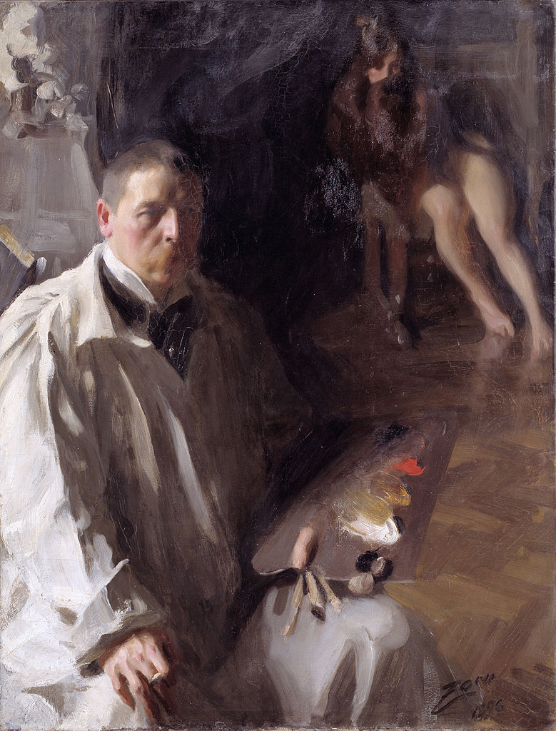
Self-portrait with model, 1896, oil on canvas
by
Anders Zorn
Lead white can be reasonably substituted with a PW6 (titanium white , PW6 (artiscreation.com), PW6 (handprint.com)) (which might be a little too opaque for some; in which case, add a little bit of Liquin/oil to get something more transparent. You can play with the ratio to increase/lower the drying time as needed).
Vermilion is nowadays quite expensive and rare; it can be reasonably swapped with a PR108 (cadmium red , PR108 (artiscreation.com), PR108 (handprint.com)). But we often don’t even need to go this bright with our reds, and a PR101 (iron red oxide/venetian red/indian red , PR101 (artiscreation.com), PR101 (handprint.com)) is sufficient: the resulting palette is now very close to what people used during the Antiquity.
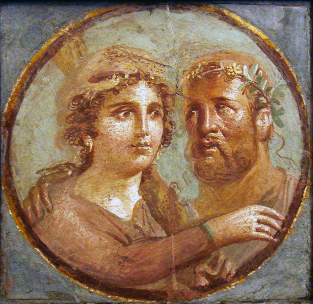
Heracles and Omphale ancient Roman fresco, Pompeian Fourth Style (45-79 AD), National Archaeological Museum of Naples, Italy.
by
Stefano Bolognini
Observe that the ivory black acts as a low-chroma blue: it really is a “primary palette”:
- yellow: PY43 (yellow ochre , PY43 (artiscreation.com), PY43 (handprint.com)) / PY42 (raw sienna , PY42 (artiscreation.com), PY42 (handprint.com));
- red: PR106 ((genuine) vermilion , Vermilion (wikipedia.org), artiscreation.com, handprint.com, naturalpigments.com) (or any of the substitute we’ve mentioned);
- blue: PBk9 (ivory black , PBk9 (artiscreation.com), PBk9 (handprint.com)).
So, what’s the point of the Zorn palette? Well:
- It’s a limited palette: the number of choices you can make
when mixing paint is limited as well, which can be convenient
for beginners. The fact that it’s a primary palette means that
you can essentially use it like a “regular” primary palette:
- red+yellow = orange;
- add complementary to lower-chroma;
- etc.
- Not only is it limited, but it’s overall low-chroma:
- The colors are closer to each others, and so it’s easier to achieve a harmonious result;
- To say it otherwise, when mixing two colors, you won’t jump too far in the color wheel: the colors are more obedient;
- It’ll act as an “Instagram filter”, toning down the chroma of whatever subject you’ll paint;
- It’s perfectly suitable for low-chroma subjects (e.g. portraiture);
- All the pigments involved are highly lightfast.
-
This is not always true depending on the seller though. For example at the moment (2024-04-18), on geant-beaux-arts.fr, W&N’s titanium white acrylic is about 30% more expensive than the oil. ↩︎
-
Have a look at Cennino Cennini’s formulaic skin tones recipes, e.g. Chapter LXVII of his Il libro dell’arte, and compare them to the “dull orange” of an HSV-oriented mindset. ↩︎
-
I mean, unless you’re purposefully looking for cracks. ↩︎
-
It’s a good beginner exercise: it develops value control, and shows the effects of adding white to lighten values compared to a transparent use of paint. ↩︎
-
IIRC, with more than 20% of liquin, the mixture is expected to yellow over time. ↩︎
-
This is a honest, unsponsored review. ↩︎
-
Remember, the “drying” process is an exothermic oxidation: oils eat oxygen, and generate heat in the process. ↩︎
Comments
By email, at mathieu.bivert chez: